
Increase sales using the traffic you’ve already got.
Sometimes just having an eCommerce website isn’t enough. You need to optimise your website user experience to ensure more visits turn into conversions. One of the best ways to do it is with a website UX audit.
You have a great eCommerce website. The visuals and content are great. And so is your product.
So why are you losing conversions?
The problem may be in your information hierarchy.
Information hierarchy, or user flow, is like the plumbing that runs under your house. No one ever sees it. But it’s essential to creating a great experience. And problems with it will really stink up the place.
Sometimes you need a plumber to come in and take care of things. It’s the same with your website.
How do eCommerce site owners troubleshoot the user flow?
A user experience audit or UX audit can help pinpoint possible pain points. It can also help you determine which areas on your website you need to improve for maximum performance.
Find out why every eCommerce owner should consider an eCommerce UX audit and how Blaze Commerce does it.

Why Is the eCommerce User Experience So Important?
User experience goes beyond a website’s appearance. A beautiful website can’t change bounce rates or generate leads. It’s simply pretty to look at.
According to Neil Patel, “44% of shoppers will tell their friends about a bad online experience.” And that’s the kind of word of mouth your business does not need.
But you can turn a visually pleasing website into a phenomenal one when you consider customer usability. Take a look at the different areas affected by user experience, and how maximising customer UX can benefit you:
#1 – Get More Revenue from Existing Traffic
Many small business websites focus on the aesthetics of their website, but forget about user experience.
One of the simplest ways to see more conversions is to set up a call-to-action (CTA) button. According to Uxeria, more than 70% of small business websites simply don’t use them. But the lack of a CTA button may be the reason why so many sales go astray during the sales process.
Customers want to make purchases with ease. You can make things easy for them by focusing on the steps of your sales process. UX optimisation can help customers start the buying process with the click of a button, increasing your conversion rates.
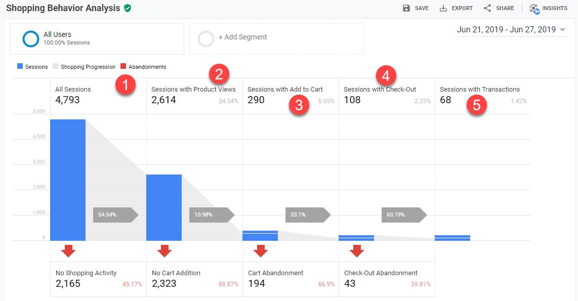
#2 – Get the Visitor to a Product with Minimal Steps
Sometimes customers know exactly what they want. Don’t make the mistake of forcing them to jump through hoops to find a product. Make the process simple by giving them a homepage search or category navigation to find your products.
Or let’s say it takes five clicks for somebody to land on their desired product page. This means they’ve had to navigate through menus and sub-menus to find what they want.
Many of your visitors won’t have the patience to do that. Plus, having such a lengthy process creates the possibility that they’ll get lost while searching for the product. Either way, you have visitors bouncing away.
#3 – Present the Product Effectively
How easy is it to actually access important product information on your website? That’s the key question you need to answer when it comes to presenting your product.
When a visitor lands on your product page, do they have easy access to reviews? Are the images presented to them both clear and professional? Does the description tell them what they need to know?
These are all aspects of product presentation that a UX audit examines.
#4 – Ensure That the Design of the Site is “Mobile-First”
Did you know that more people than ever use mobile devices to browse websites?
As many as “four out of five mobile users access online shops on their smartphones,” according to Comscore. But users won’t stick around if your website doesn’t display well on their mobile devices.
A small font size could make it impossible for the visitor to read product descriptions. A navigation system that isn’t adapted for mobile use makes it hard to explore the site. These are all issues that will cause mobile users to bounce away from your website.
Ultimately, improving your mobile UX leads to higher revenues with each visitor. And it also leads to higher visitor satisfaction.
But you can’t make the changes until you audit your website to find out where your challenges lie.

What Does a UX Audit Involve
A UX audit can give you a comprehensive look at what’s going on “under the hood” on your website. A full website audit includes elements like:
UX Analysis and Assessment
It all starts with a full analysis and assessment. The UX analysis looks at everything pertaining to your eCommerce website, such as:
- Homepage
- Category navigation
- Product details page
- Product lists and filtering
- On-site search
- Check out process
Experts will also assess your mobile web user experience, because many of your users will probably come from this type of platform.
Detailed Report
Of course, the analysis and assessment won’t help you unless you know what to do with the information. Expect a detailed report to let you know what the usability researchers found. And how to make improvements.
Each suggested improvement includes details about the UX challenge identified. The details also include possible solutions. The improvement suggestions are all backed by UX research and made by a qualified specialist.
The suggestions also include 1–4 best practice examples so you can see how leading eCommerce sites handle those issues. Their examples show you how improving your UX leads to a better purchasing experience for your visitors. Ultimately, that better experience leads to more sales and higher revenue.
UX Performance Comparison
If you ever wonder how your website stacks up against the competitors, these UX scorecards can tell you.
You’ll receive over 650 UX performance scoring parameters on six detailed scorecards. You can use these to see how your UX performance compares to the 60 top-grossing eCommerce sites.
Video Conference Consultation
Sometimes a written report just isn’t enough. That’s why your UX audit also includes a 2-hour video conference.
The conference includes discussions about the audit results included in your detailed report. We’ll also go over our suggestions for improvements with you. And of course, you’ll get answers to any questions you may have in real-time.
UX Auditor Follow-Up Calls
Feedback is very important, especially when you make major improvements. Whether you redesigned your product page or have a new prototype, your UX auditor is there to help.
You’ll receive three follow-up calls within four months of your audit findings. These follow-up calls can help you avoid making expensive mistakes as you make changes. Also, you can address any potential follow-up questions from your team that didn’t come up during the video conference.
Each 30-minute call is a treasure trove of potential feedback. Find out if you’re on the right track or if you should reassess changes. And you don’t need to do another full UX audit to get a measure of how you’re doing now.
The Six Areas We Audit
There are six areas that we audit for your site or prototype. You can choose to have one or more areas audited. But most clients choose to go with all six areas.
These six areas, put together, make up a full-site UX audit. Of course, you can simply choose the areas you think need work. And that’s a good start.
However, each audited area has a compounding effect. It’s only after auditing all six that you can create the outstanding UX your customers expect.
These are the six areas that we focus our audits on:
Area #1 – Homepage & Category Navigation
Website design and user experience is everything for eCommerce websites. As much as 75% of visitor judgements about a website’s credibility comes purely from aesthetics. That’s why we audit all aspects of your homepage and category navigation.
Area #2 – On-Site Search
There’s nothing worse than getting a “No Results” page when looking for a specific product. We look at the type of search queries you have on your website, as well as the search engine support code.
Also, we audit what and how searches use your product data and autocomplete suggestions. Being able to find products quickly can make all the difference in your conversion rates. So we assess your search layout and features, too.
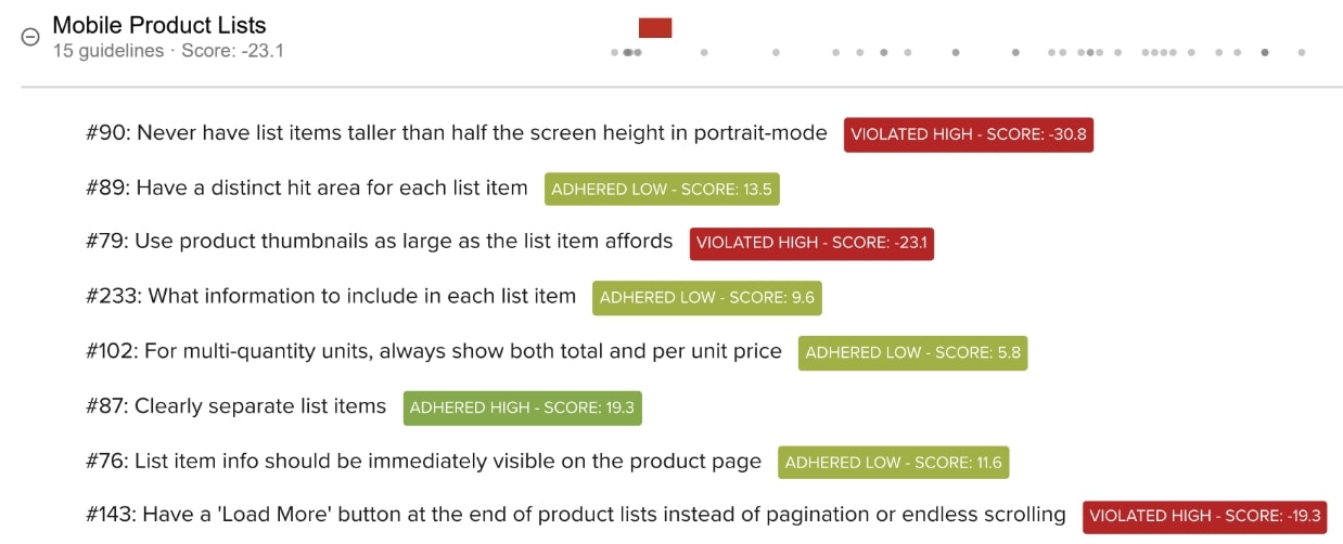
Area #3 – Product Filtering and Lists
Do your product filtering and lists make sense from a customer perspective?
This audit covers UX experience and design for all aspects of your category and search product listing pages. We also analyse how products load, product thumbnails, and many other filter features.
Area #4 – Product Details Pages
A poorly designed and executed product page turns customers away. So, we look at all aspects of the design and usability for your entire product page execution.
Area #5 – The Checkout Process
The checkout process can make or break your business. If your checkout process isn’t simple enough for your users, you end up with costly cart abandonment issues resulting in lost sales.
In a survey of 4,263 US adults, researchers asked for the top reasons for cart abandonment. 23% of people pointed to a complicated checkout process as being the issue.
In other words, a poor checkout process could cost you nearly a quarter of your potential customers. That amounts to huge losses that a better UX would avoid.
Audits in this area include a full analysis of your website’s checkout flow. This includes everything from the shopping cart to error message wording.
Area #6 – Mobile Device Optimisation
Since many users use a mobile device to look at websites, it’s critical that you optimise yours. We look at all the areas listed above, as well as mobile-specific challenges like:
- Touch interactions
- Hit areas for the main menu
- Mobile search and image zoom
We also assess how your website interface handles issues where there’s a lack of page overview on the customer’s phone screen.
The Most Common UX Issues
Want to know the most common user experience violations we find when reviewing and auditing online stores? See The Top 18 Usability Issues that Cost Online Stores Sales.
Case Study
A huge 72% of Truckers Toy Store’s traffic comes from mobile devices. Even with this river of mobile traffic, the store had not invested in mobile optimization. Its mobile e-commerce UX was bad.
That terrible UX meant thousands of qualified shoppers a month simply clicked away. They didn’t buy anything because they wouldn’t tolerate the poor experience.
Click here to read How Truckers Toy Store Boosted Mobile Conversion by 22.3% in ONE Month (And Four Tips to Help Boost Your Conversion, Too)

Recommendations for the 20-40 priority areas where you could take action right now.
What might a mobile UX audit be worth to you?
If you’re earning at least $15,000/month from your online store, you’d need only a 0.66% increase in your conversion rate to cover the investment in of audit in just the first three months.
If you’re earning more than $15,000/month, you can imagine how fast and easy it will be for you to get a massive return on your investment in a mobile UX audit.
There’s no debating that the rewards can be sky high for e-commerce stores as soon as you’ve identified the barriers to mobile conversions.
Boost Your eCommerce UX with a Full Audit
Visitors quickly turn away from websites that give them a bad user experience. And they’ll tell their friends about it.
But delivering good website user experience has the opposite effect. Not only does it increase your revenue with existing traffic, it also encourages repeat customers.
The first step, though, is to receive a proper website UX audit. This audit helps you pinpoint where you can make improvements and remain competitive.
If you’re ready to find out more about audits, Blaze Commerce’s UX Auditing Service can help.
Contact us for more information or to schedule a discovery call.