
Imagine a bustling ecommerce marketplace, teeming with customers.
Their faces reflect a perfect mix of anticipation and satisfaction.
Every one of them is effortlessly navigating through various product categories, filtering items based on their personal preferences, and swiftly finding what they’re looking for.
This is an online marketplace optimized with efficient User Experience (UX) techniques.
This image epitomizes the success of the UX theme we will dive into today, ‘Product List & Filtering’.
In an ideal ecommerce world, this picture should be the reflection of every digital storefront.
An optimal browsing experience, seamless navigation, and ease of finding the right product are what customers yearn for.
We’re here to discuss how that picture can be your reality – that reality where your potential customer, amidst intense competition and a sea of options, stays on your online store and makes a purchase.
That reality where you provide such a well-designed product list and filtering system that visitors find exactly what they need, without getting lost or feeling overwhelmed.
Product List & Filtering are essential components of The Importance of Good UX in E-Commerce to Maximize Conversion Rate.
This post will delve deeper into the 22 ‘must-have’ UX guidelines for Product List & Filtering that can transform your e-commerce platform into a conversion powerhouse, just like the one our night-owl mom is enjoying.
Essential Product List UX Guidelines
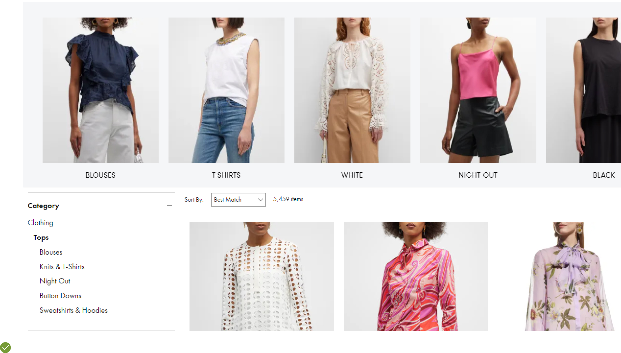
UX Guideline 1. Prioritize Diversity in ‘Relevance’ Sorting
Issue: Your customers make assumptions about your inventory based on the first few products they see. If the products don’t represent the full range, they might assume that you lack diversity and miss out on what they’re looking for.
Advice: Make sure the initial 10 to 20 products reflect the range of all significant product types within the category. This should be implemented as a diversity-based matrix under the default “Relevance” sort type.
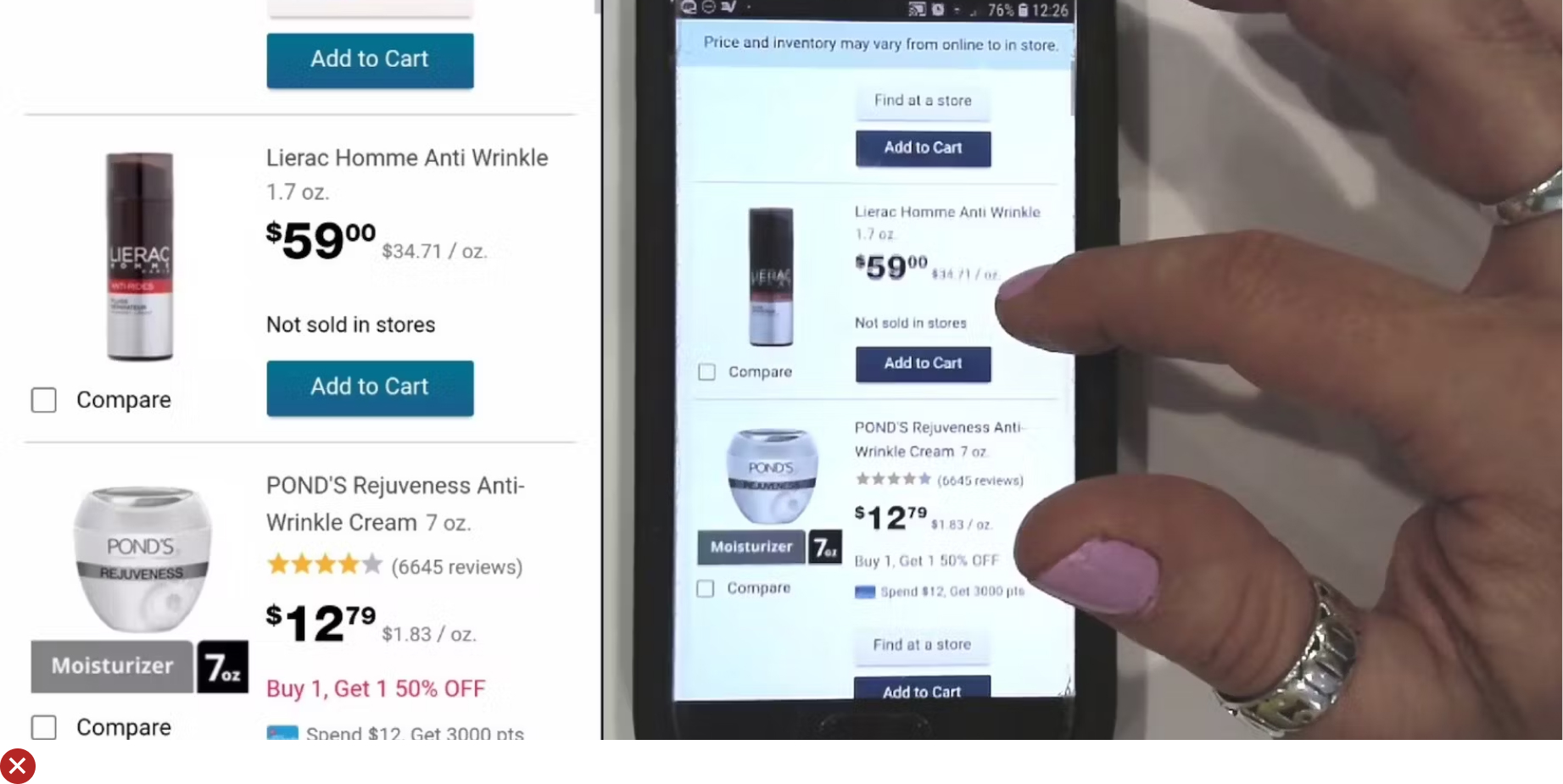
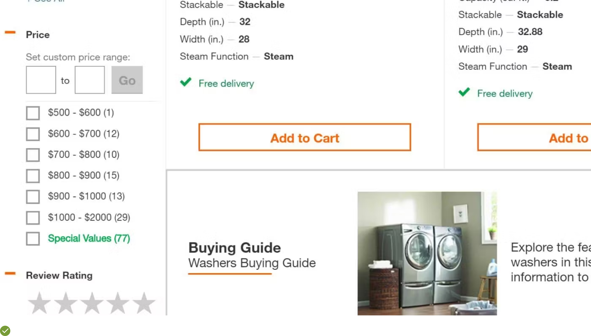
Example: Home Depot’s “Best Match” sort type features a range of refrigerators in different sizes, finishes, and price points, effectively showcasing the category’s diversity.
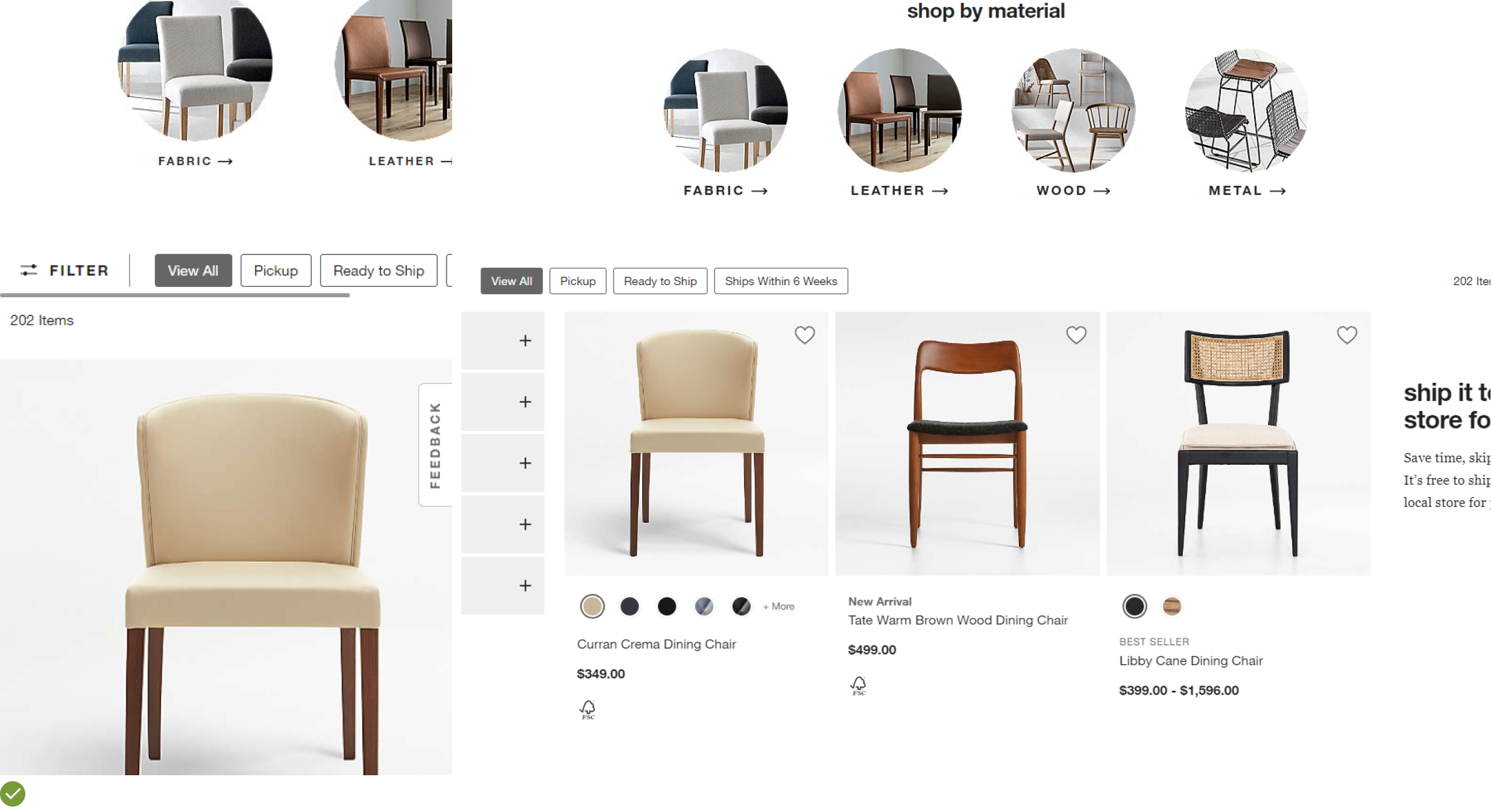
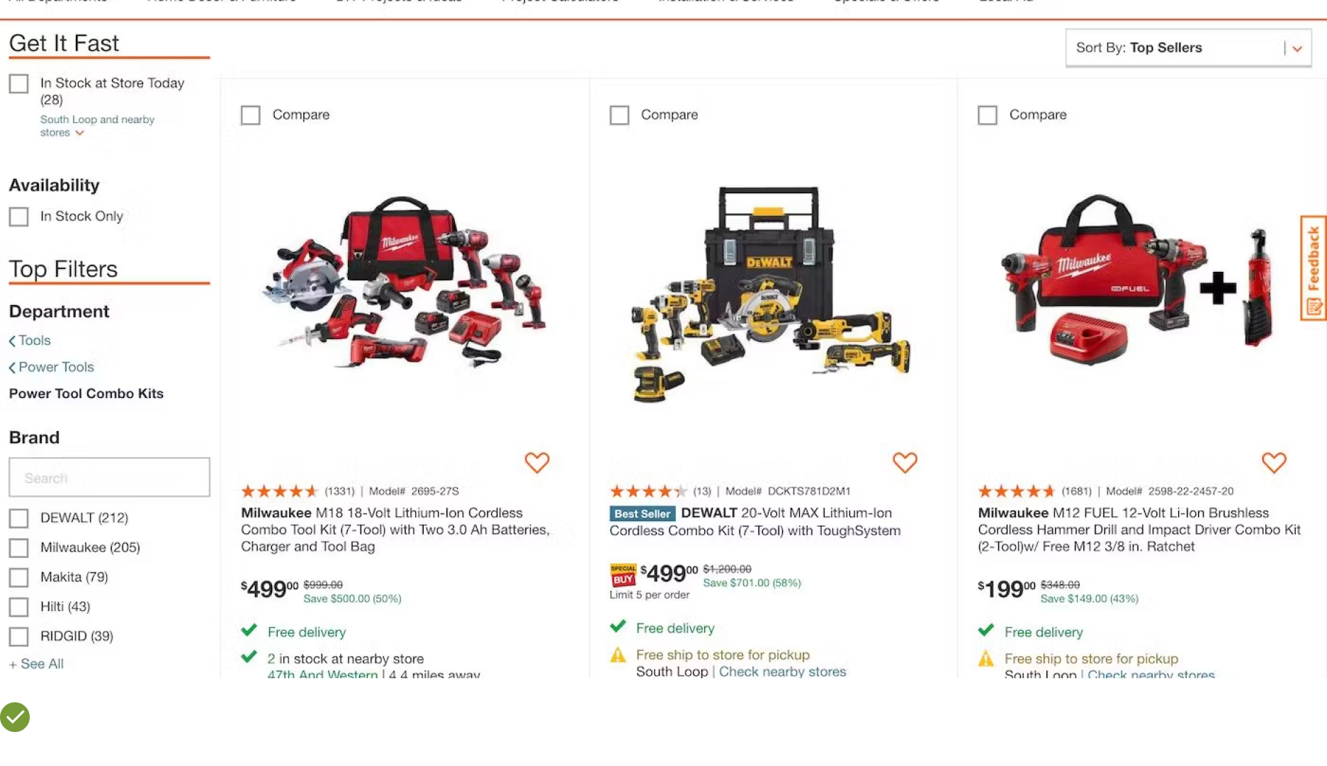
UX Guideline 2. Avoid Product List Segmentation
Issue: When product lists are subdivided, users might overlook certain sections and miss suitable products.
Advice: Keep your product list as one single list to provide a clear overview of all available items.
Example: The “Chairs” subcategory at Crate & Barrel isn’t subdivided, allowing customers to easily view the full extent of the catalog.
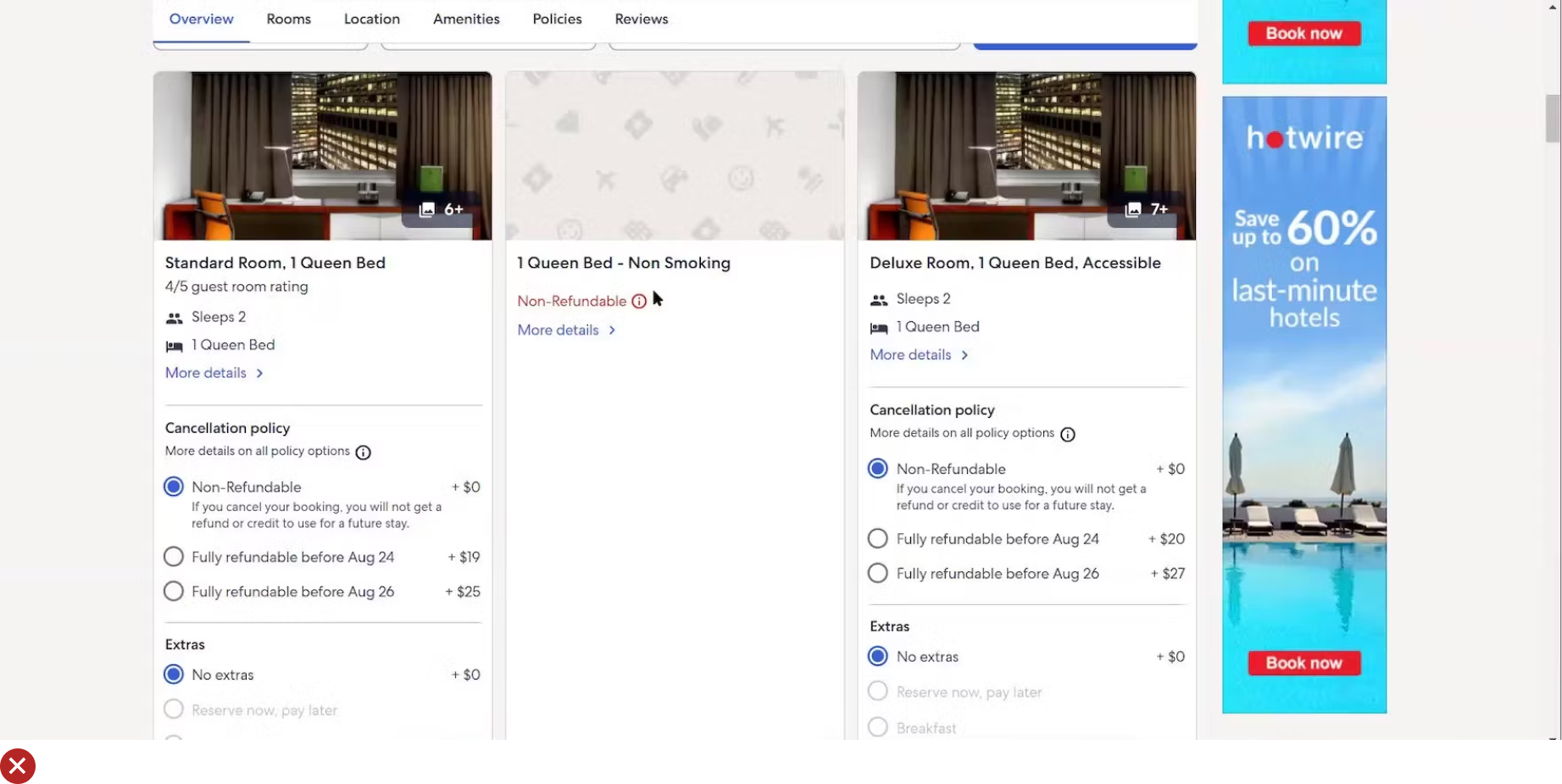
UX Guideline 3. Improve Clarity in Sort Types and Directions
Issue: Small naming details can make sorting options unclear, leading to confusion.
Advice: For bi-directional sort types, use explicit “(low to high)” terminology. But for one-directional types, opt for more natural phrases. One-directional types should only be used for categories with a singular preference, like ‘Customer Ratings’, ‘Best Sellers’, or ‘Date Added to Site’.
Example: Most operating systems use a checkmark in native dropdowns to signify the currently applied option, making it stand out from others.
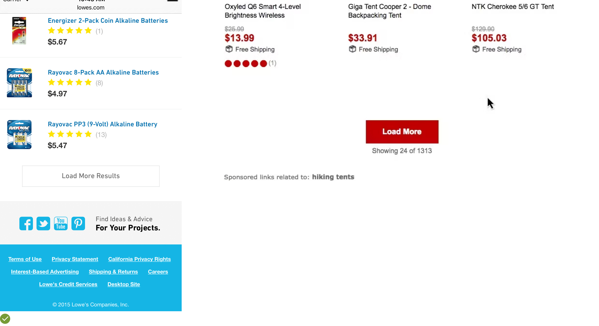
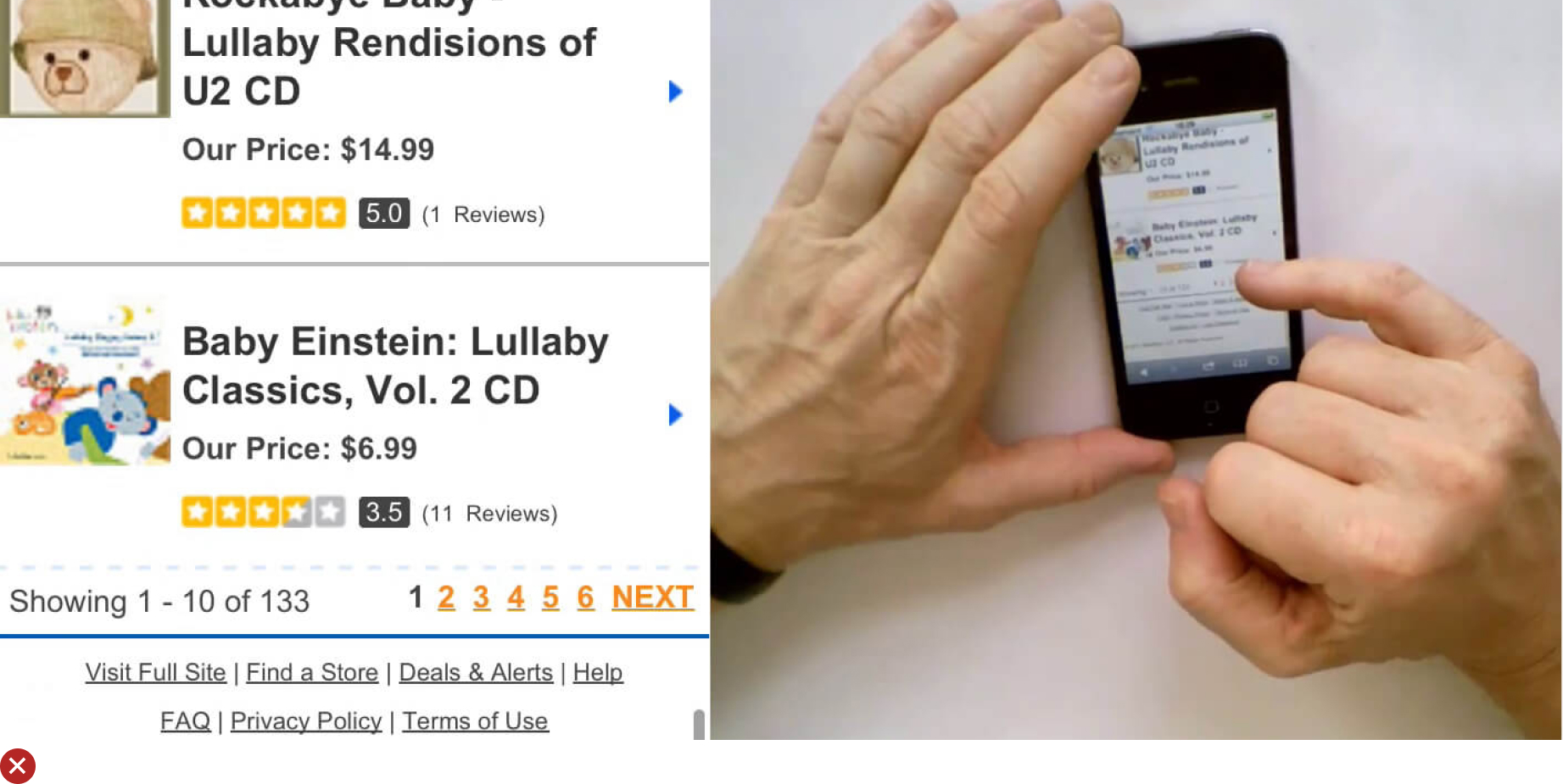
UX Guideline 4. Determine Optimal List Item Loading
Issue: Loading too few or too many products at once can hinder customer experience. A small load might fail to demonstrate the range of products, while an excessive load might overwhelm customers.
Advice: With dynamic product loading, aim to load 100–150 items at once for visually driven product lists and 50–100 items for spec-driven lists on desktop. For mobile, regardless of list type, load 15–30 items at a time.
Example: Users often feel comfortable viewing up to 150 products per “page” on visually driven sites, provided there are periodic “Load More” interruptions.
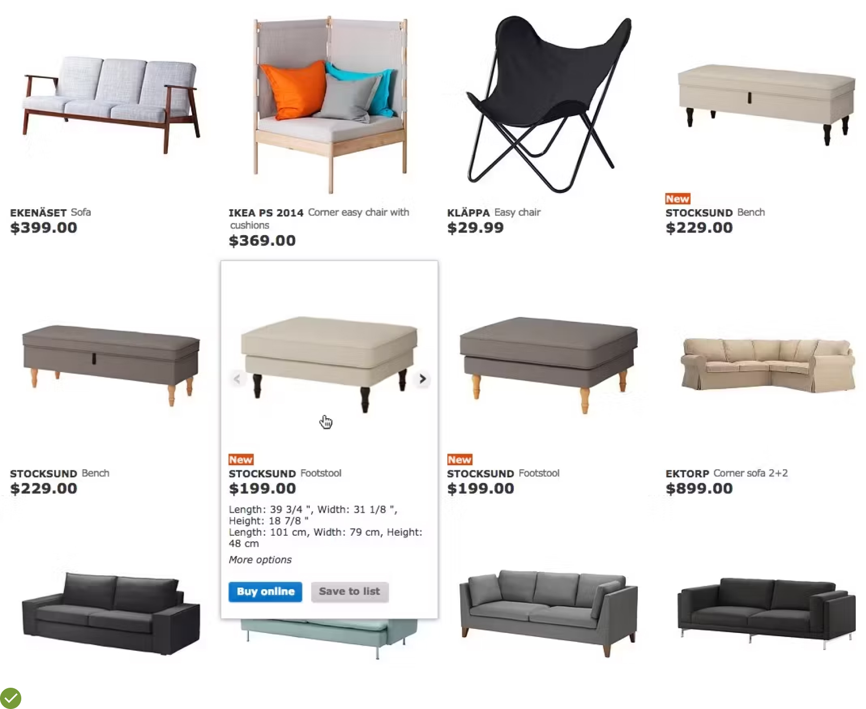
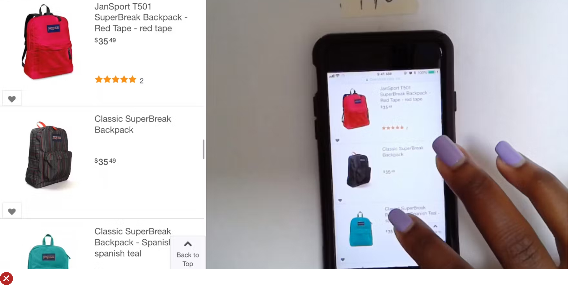
UX Guideline 5. Ensure Availability of Thumbnails for All List Items
Issue: Missing thumbnails or placeholder images can give an impression of unavailability or incompleteness of a product, potentially leading to a negative perception of the site.
Advice: Make sure you provide thumbnails for all list items, even if the products aren’t highly visual (like information products).
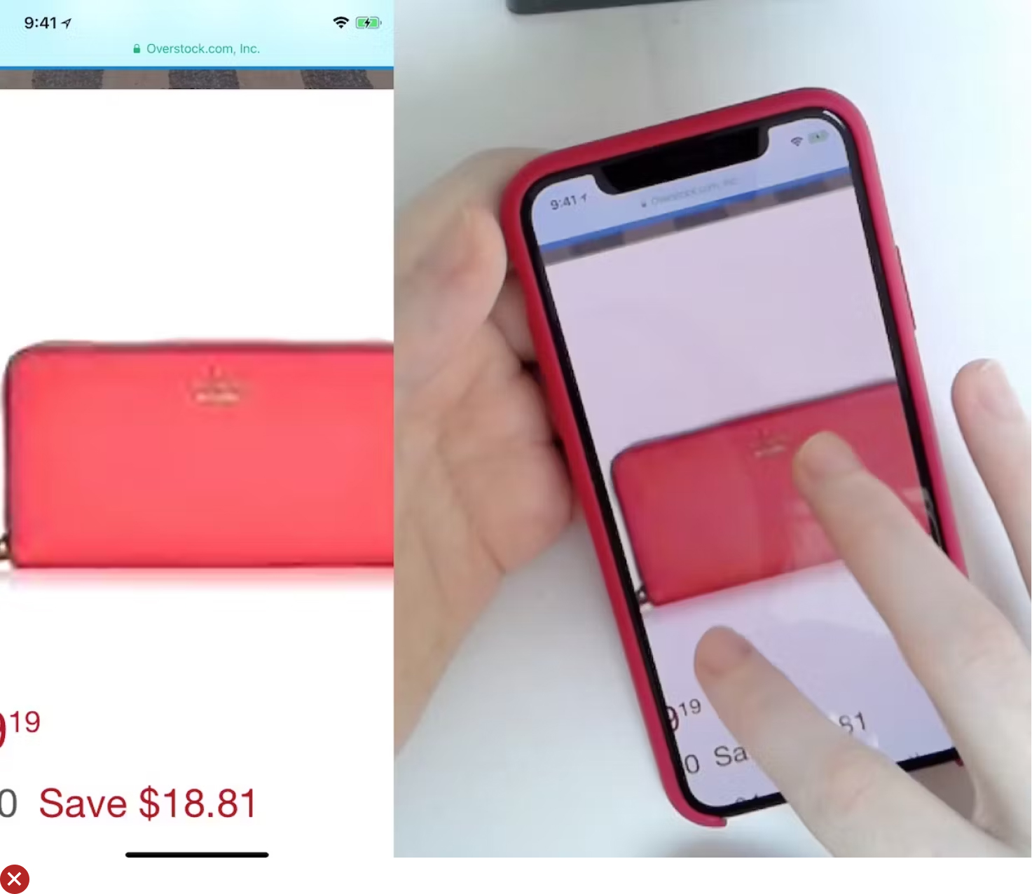
Example: Even for digital downloads, thumbnails can help differentiate between product versions. Note how each version’s thumbnail targets a different audience and emphasizes varying features.
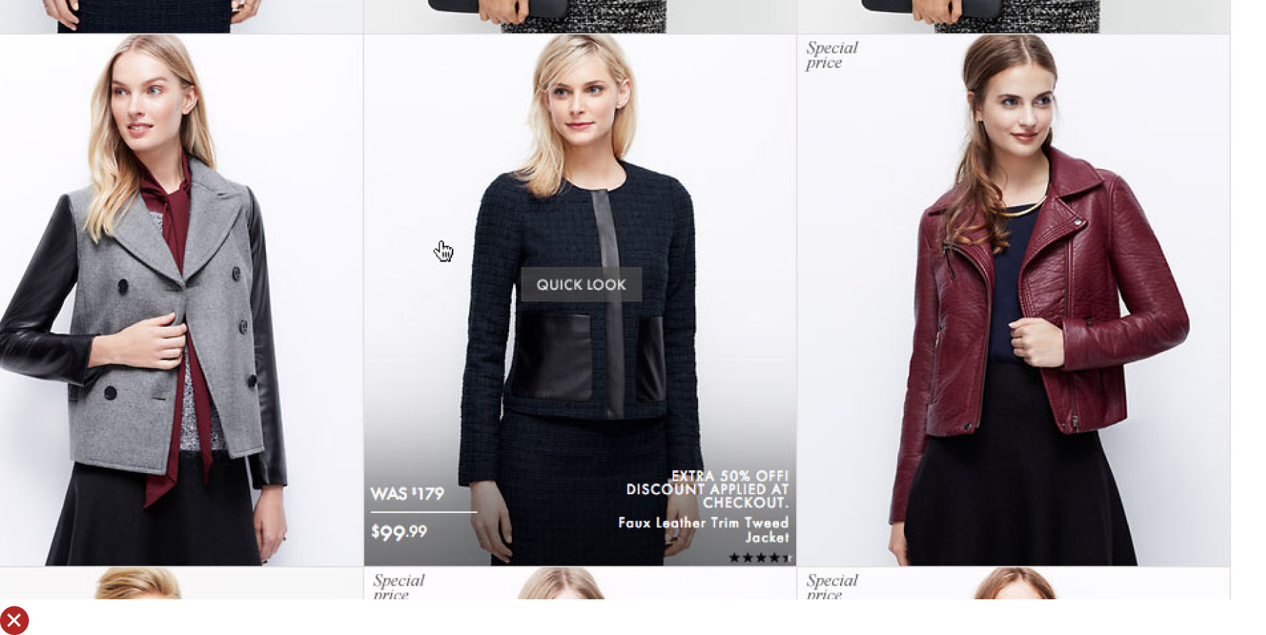
UX Guideline 6. Enhance Product Understanding with Secondary Thumbnail on Hover
Issue: Limiting product representation to a single static image denies customers the chance to acquire additional visual details. This can hinder product understanding and impact decision-making.
Advice: Augment the primary “Cutout” thumbnail with a secondary thumbnail that appears on hover. This can be a “Lifestyle”, “Compatibility”, “Feature Callout”, or “Product Variation” thumbnail, depending on the product type.
Example: Observe how jackets are presented on H&M’s website. The “Cutout” thumbnail (first image) gives way to a “Lifestyle” thumbnail on hover (second image), providing a real-world context while allowing clear inspection of the product. Other successful secondary thumbnails include “Compatibility” thumbnails, particularly useful for items like chargers, “Feature Callout” thumbnails to highlight unique product aspects, and “Product Variation” thumbnails to reveal different options and details.
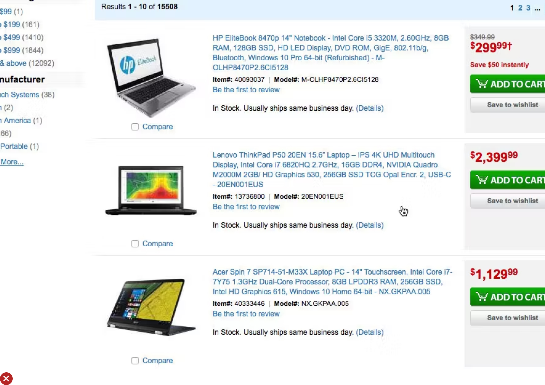
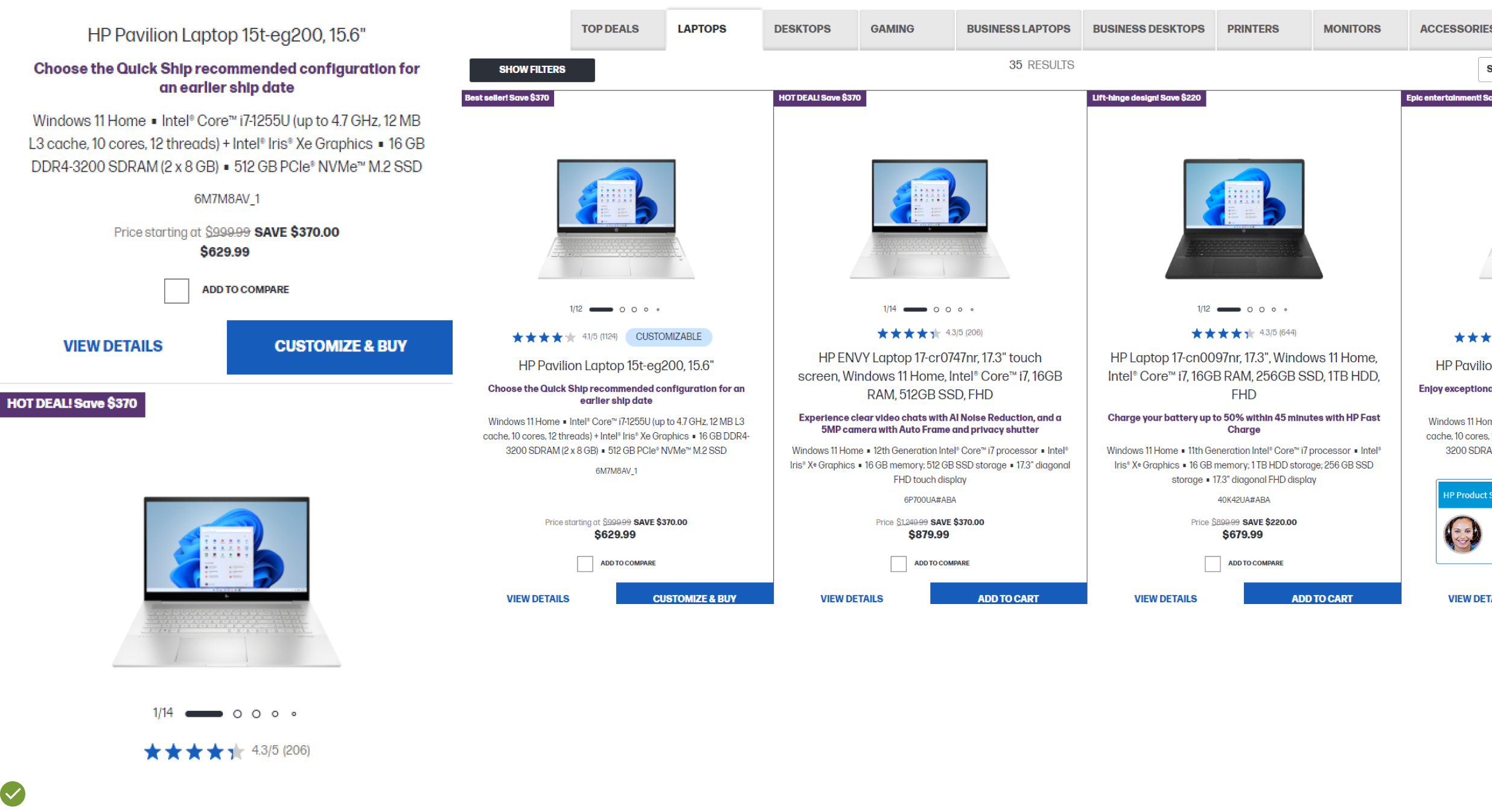
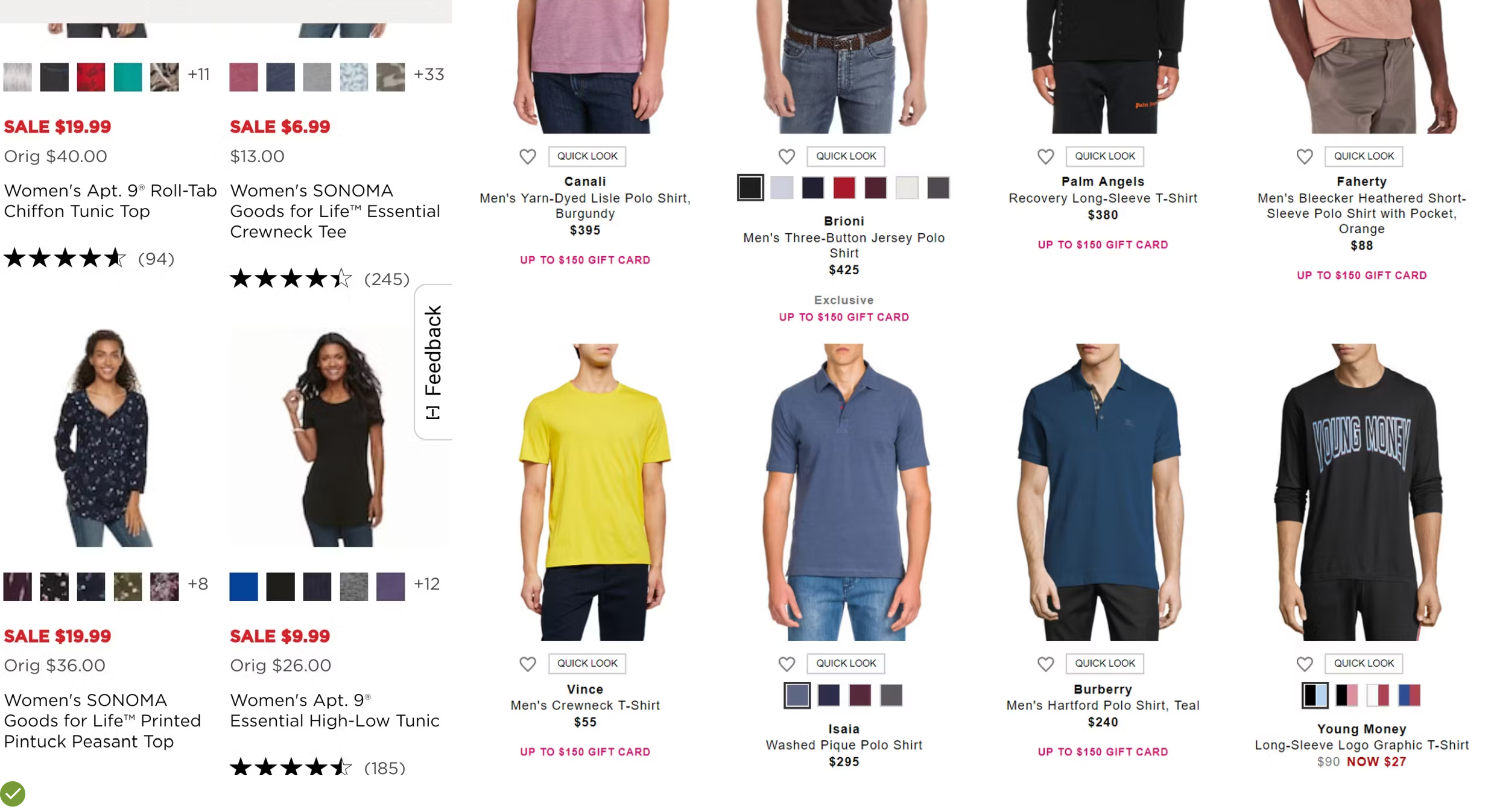
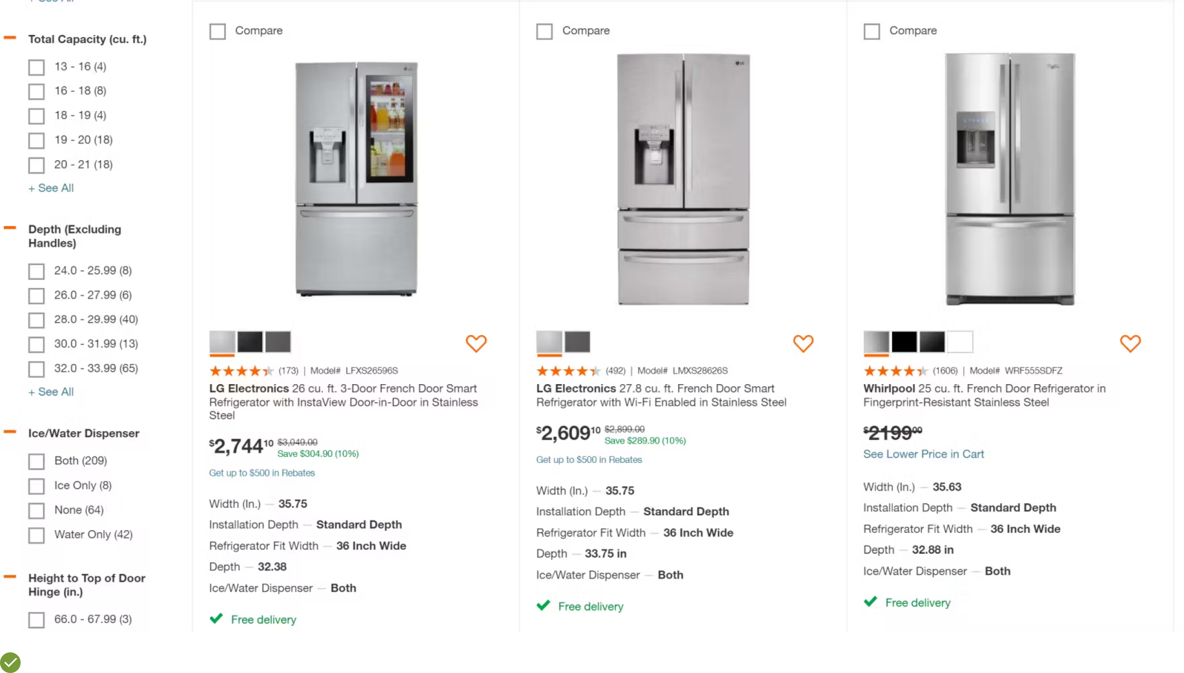
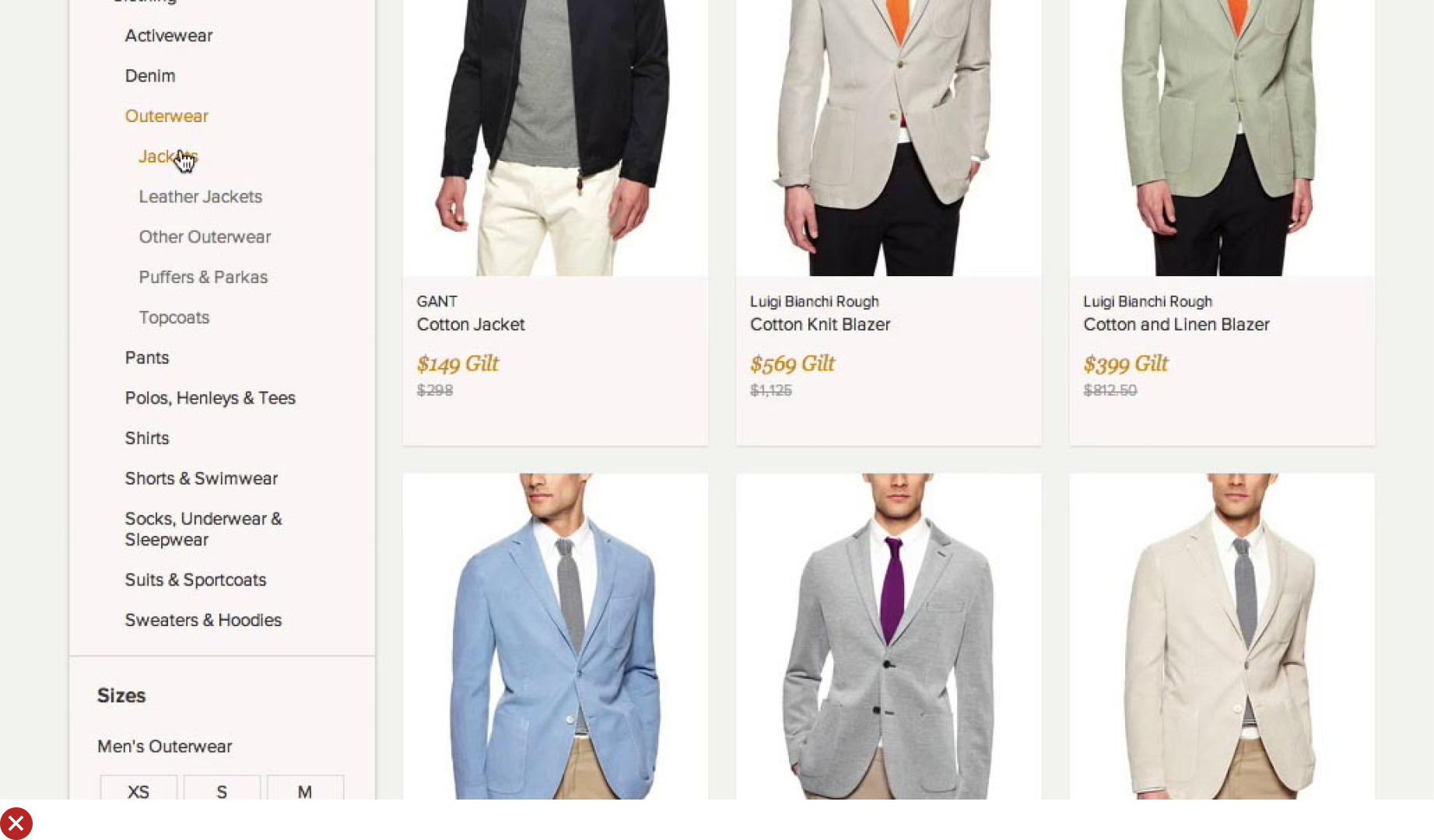
UX Guideline 7. Consistent Presentation of Product Attributes Across List Items
Issue: Inconsistent attribute presentation across similar items hinders product comparison, prompting needless detours to product pages or causing users to overlook fitting products.
Advice: Ensure the same product list consistently includes and presents the same information. This aids in easy product comparison.
Example: Take HP’s product lists where similar specs are included and presented in a consistent manner. A steady attribute order, visual distinction and uniform bullet-point format enable easy attribute comparison across different laptops. The exception lies in search results where contextual search snippets, highlighting user query relevance, are more important than strict attribute consistency.
UX Guideline 8. Incorporate ‘Essential’ and Category-Specific Product Attributes in List Items
Issue: Insufficient or irrelevant list item information may lead users to discard suitable products inadvertently.
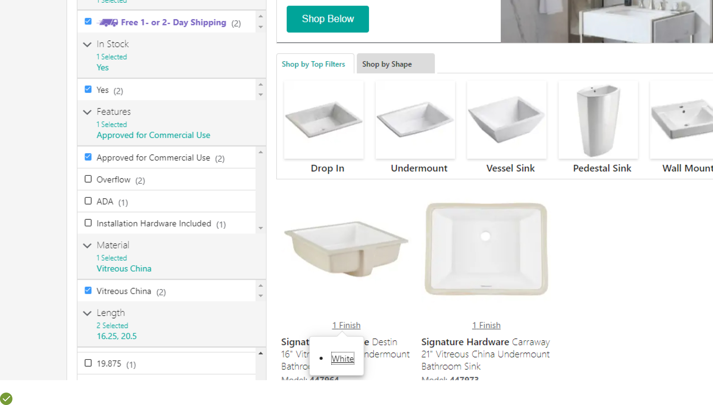
Advice: Each list item should include price, product thumbnail, title or type, variations, user ratings, and 1–3 category-specific attributes to assist informed decision-making.
Example: Including the five essential attributes – price, product title or type, thumbnail, ratings, and product variations – in every list item will greatly improve user understanding of the product.
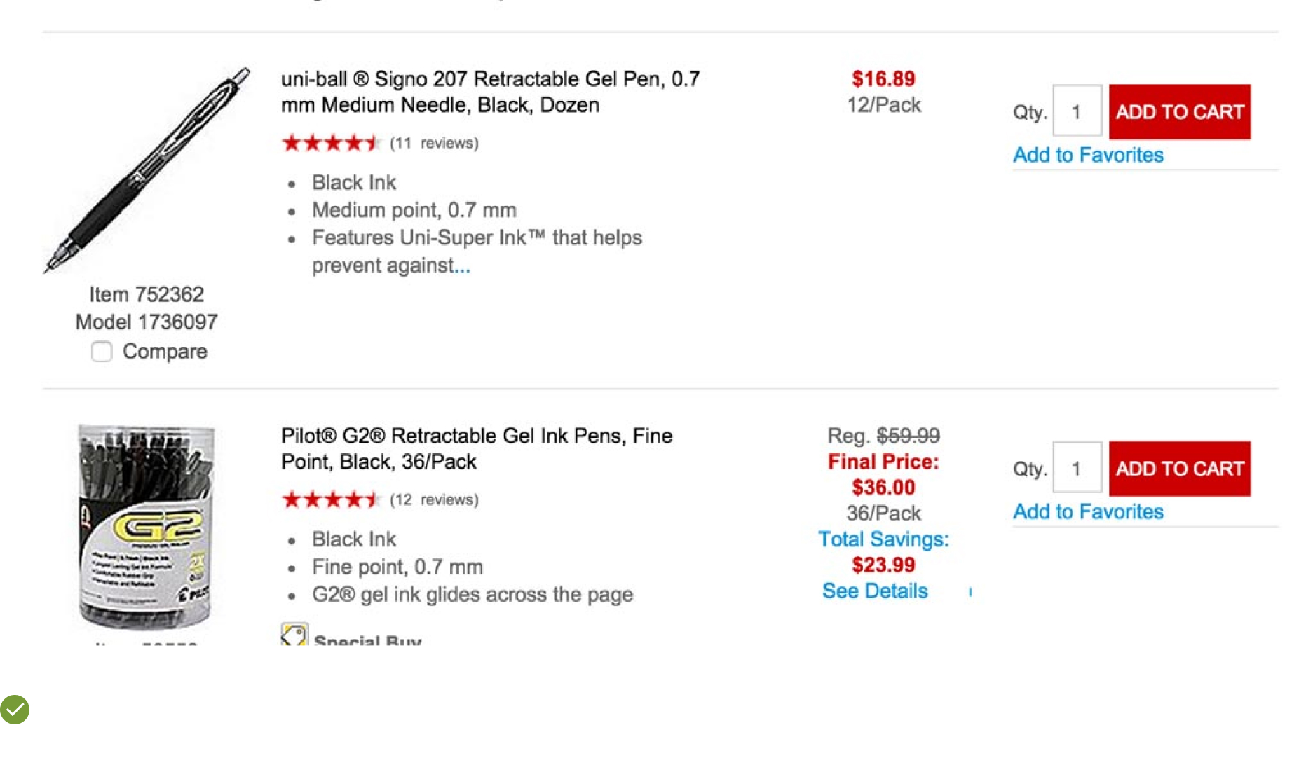
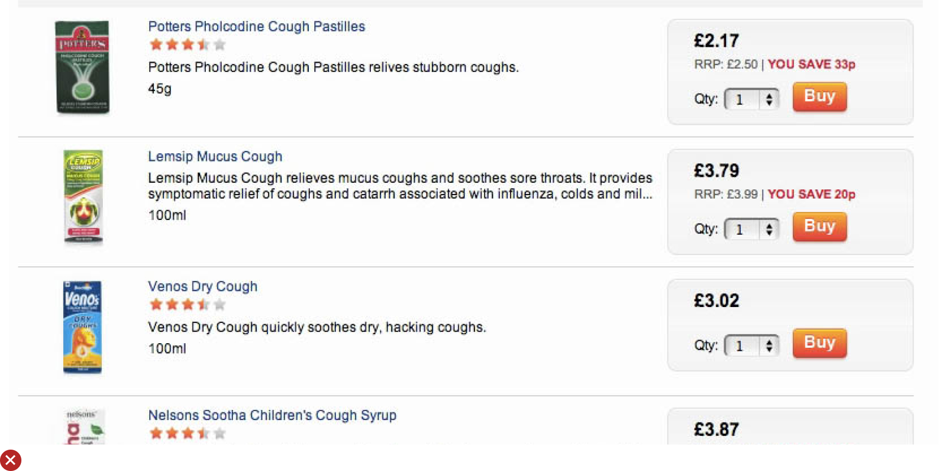
UX Guideline 9. Display ‘Price Per Unit’ for Multi-Quantity Items
Issue: The absence of precise price comparison may lead users to overlook better deals or reject cost-effective items.
Advice: Exhibit the “Price Per Unit” in product lists where item quantities vary. For similar product types with different compositions, consider a “Price per Treatment” or similar display.
Example: Zooplus facilitates easier selection between product types and pack sizes by providing unit costs. This eases the comparison process by eliminating the need for users to calculate unit prices.
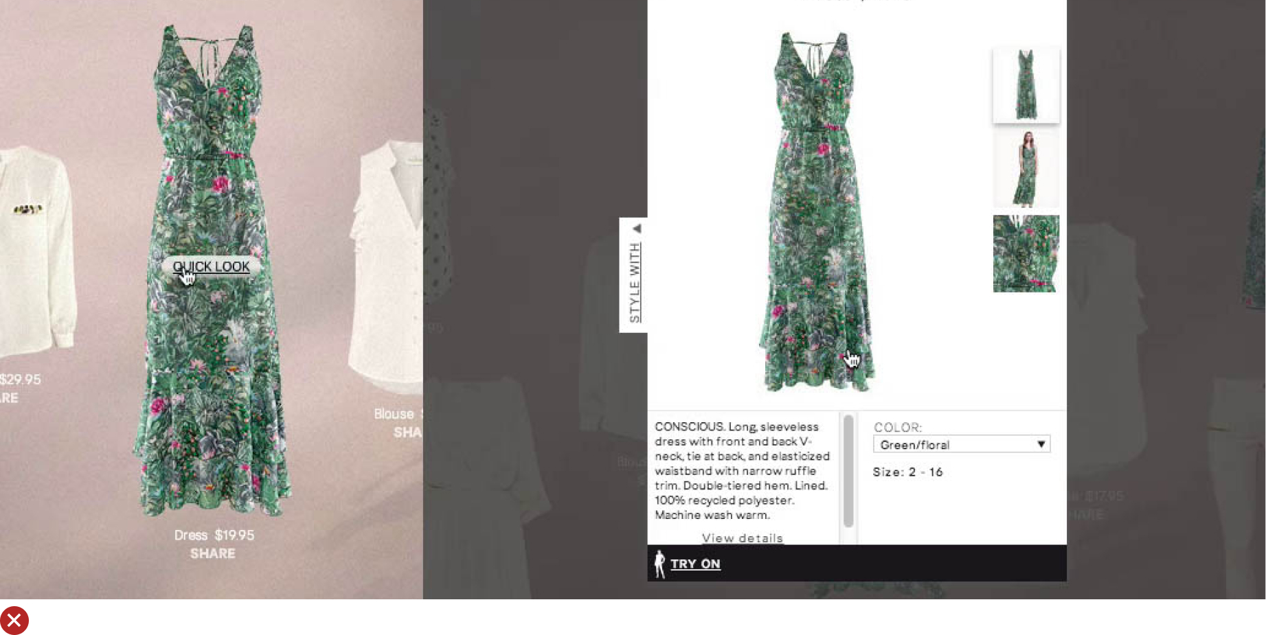
UX Guideline 10. Exercise Caution with “Quick Views”
Issue: Users may mistake “Quick Views” for the product page, resulting in missed product information and features.
Advice: Exercise discretion when using “Quick Views”. If necessary, ensure “Quick Views” are distinguishable from the product page, are difficult to unintentionally open, and that the browser’s “Back” button only closes the overlay.
Example: If list items offer sufficient product information and clear thumbnails, “Quick Views” become unnecessary. For instance, Urban Outfitters places their “Quick View” link (“Quick Shop”) at the thumbnail bottom, minimizing accidental clicks. Ensure a prominent link or button leading to the product page is provided within the “Quick View”, with the product list visible behind the “Quick View” overlay for clarity.
UX Guideline 11. Streamline Product Variations into Single Entries
Issue:: Customers may feel overwhelmed by multiple list entries depicting product variations, potentially leading to frustration and shopping cart abandonment.
Advice:: Consolidate all product variations under a single entry, displaying a clear count of available variations.
Example:: In its product listings, Kohl’s merges colour variations into individual entries, supplemented with prominent colour swatches and clear indicators of the number of truncated colours. This simple strategy offers users a comprehensive view of the product range, ensuring they won’t miss any important variations.
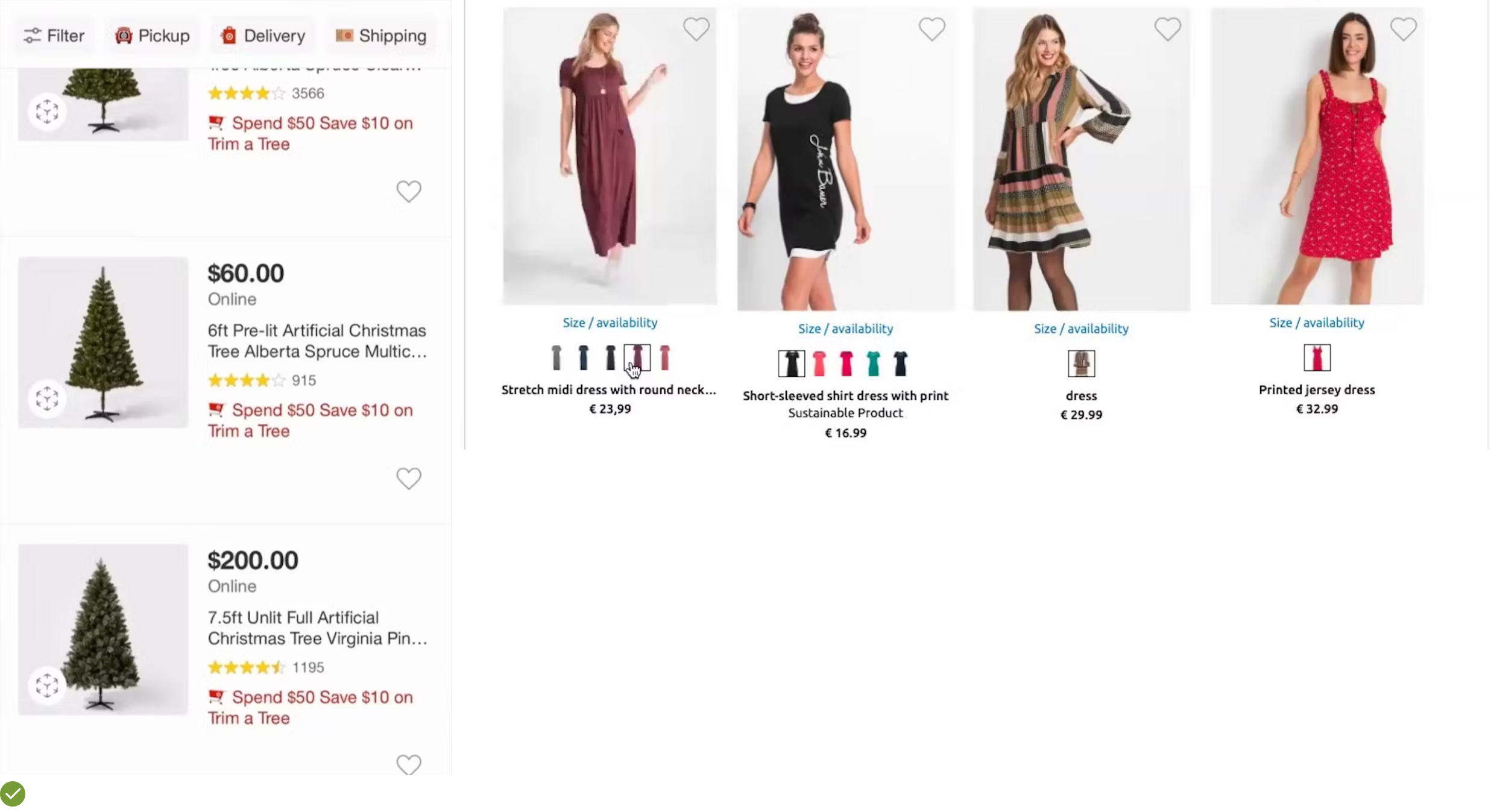
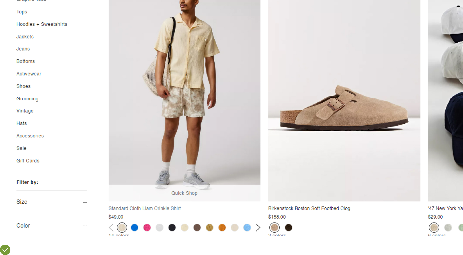
UX Guideline 12. Display colour Variations through Swatches
Issue:: Customers might miss crucial colour variations due to lack of visual indication, resulting in less optimal product selections.
Advice:: Implement colour swatches to signify colour variations. For single-colour products, use either a single swatch or text. Ensure swatches are large enough to provide accurate visual data, and if all colour variations can’t be displayed at once, provide a clear indicator of the total number (e.g., “+11”).
Example:: Kohl’s mobile site utilizes large, distinct colour swatches for its products. If all colour variations can’t fit on one line, they signify the number of additional colours available (e.g., “+8”), effectively informing users of the full range of colour options.

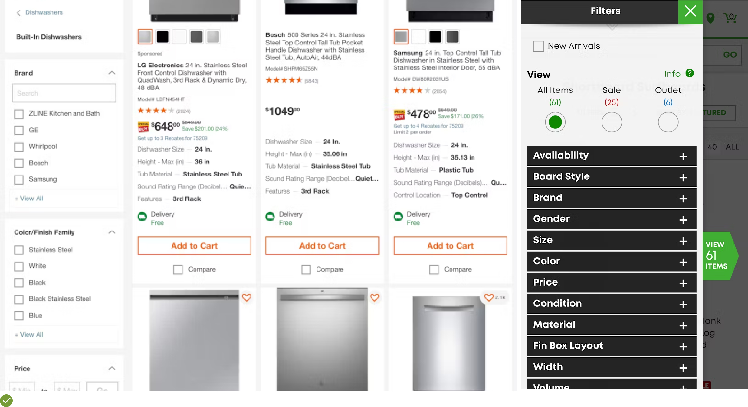
UX Guideline 13. Display the Total Count of Product List Items
Issue:: Without knowing the total number of items in a product list, users may lack crucial data for assessing the list’s relevance and depth.
Advice:: Clearly present the total number of items within the product list, positioning it both at the top and bottom of the list. The figure should be easily distinguishable for users who need this information, without causing unnecessary distraction for those who don’t.
Example: Neiman Marcus displays the total item count right above the product list and under the filters, making it readily visible and easily associated with the product list.
UX Guideline 14. Preserve User’s Position in the Product List when Navigating Back from a Product Page
Issue:: Returning users to the beginning of a product list instead of their last position can lead to frustration and the possible abandonment of the purchase journey.
Advice:: Ensure that users are returned to their exact position in the product list after visiting product pages.
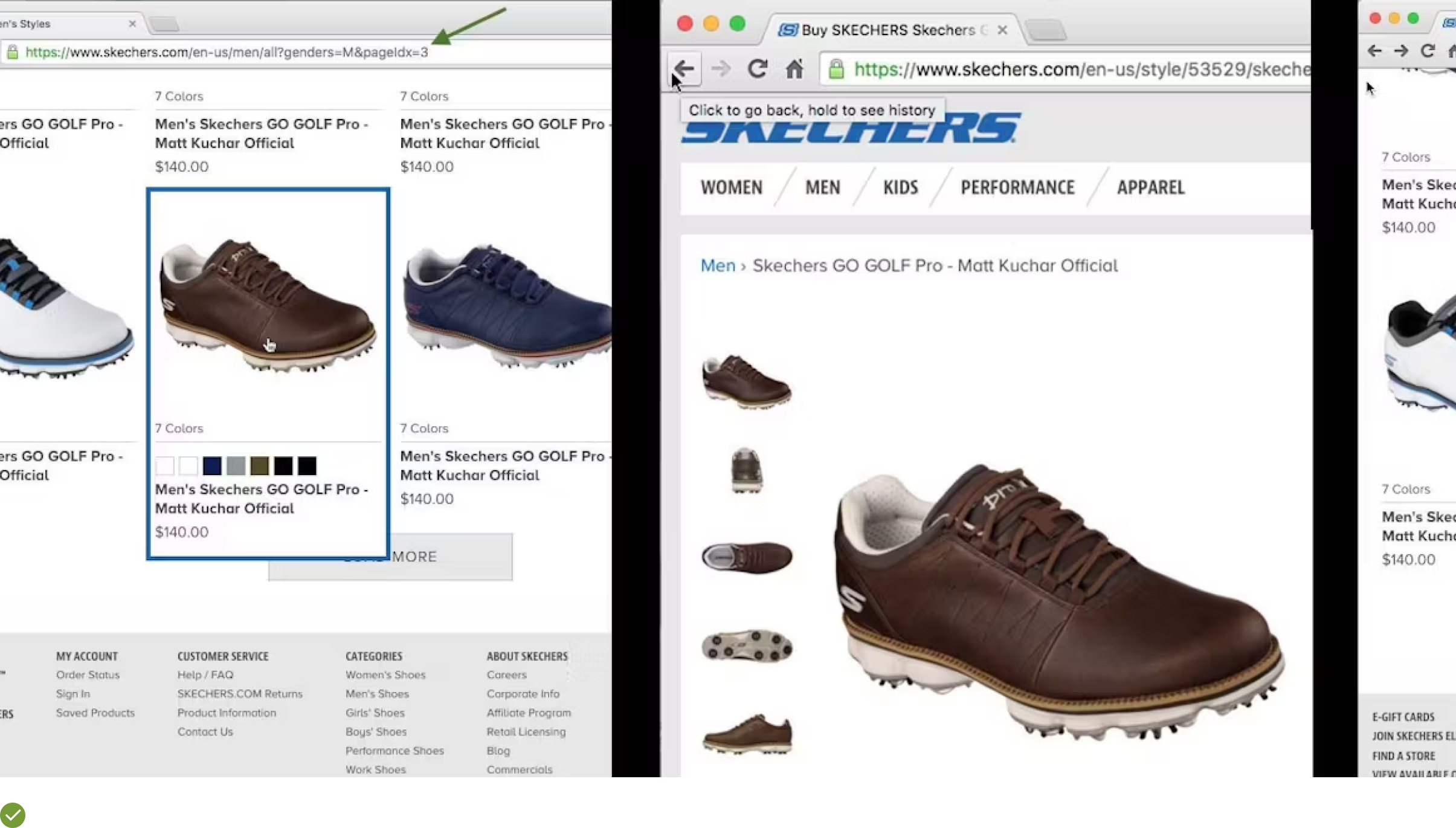
Example:: Skechers.com has an effective “Load More” functionality that amends the URL every time a user clicks the button. As a result, when users press the browser’s “Back” button from a product page, they are returned to their original position in the product list (e.g., “page 3”).
Essential Filtering UX Guidelines
UX Guideline 15: Enable “Product Status” Filtering as Necessary
Issue: Not providing appropriate product statuses could lead to users scrolling through a plethora of irrelevant items. This diminishes the relevance of their search, leaving them overwhelmed and dissatisfied.
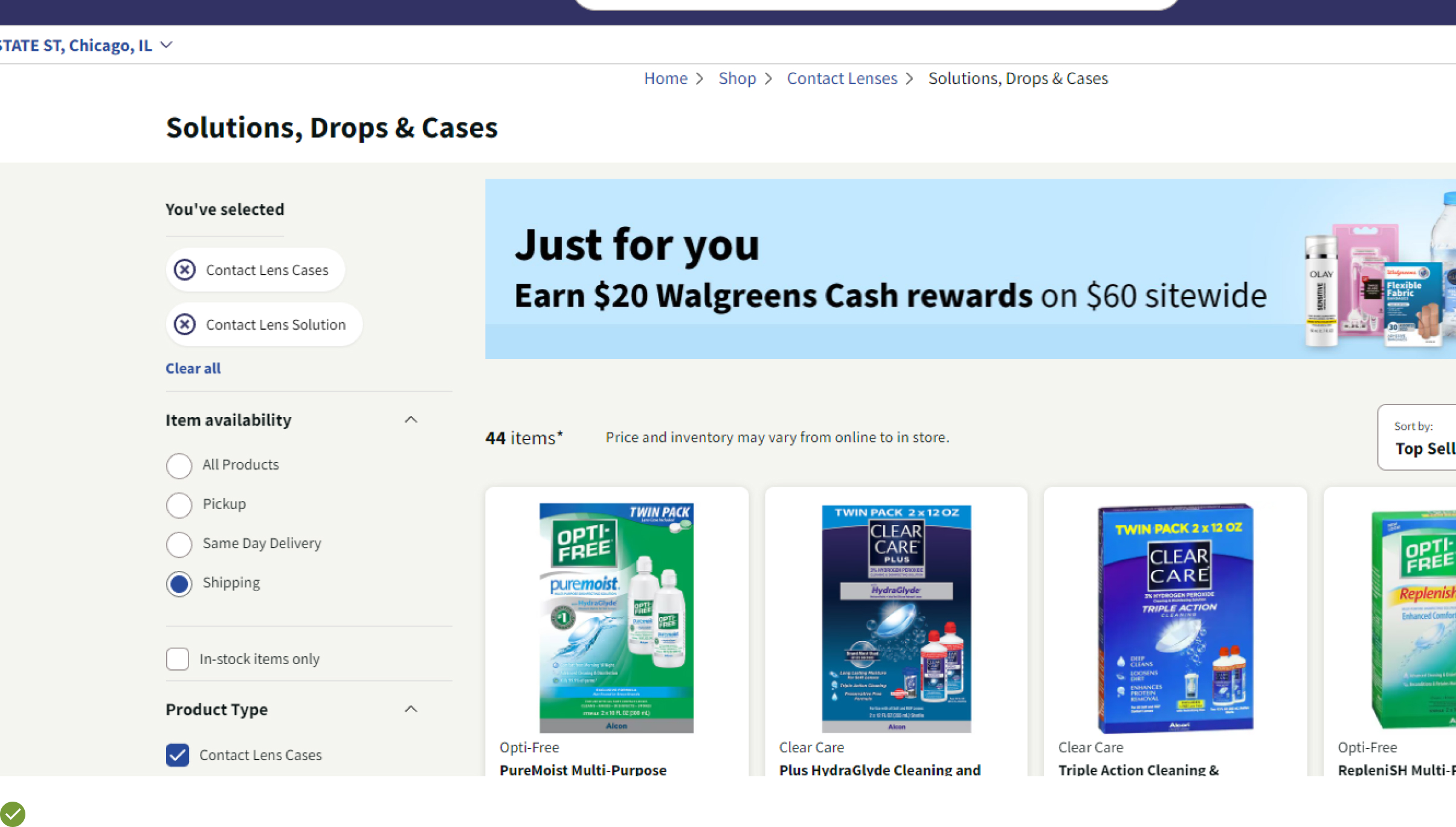
Advice: Implementing “Product Status” filters such as “Out of Stock,” “New,” “1-day Shipping,” and more, can greatly enhance user experience.
Example: On Etsy, users can conveniently sort products based on shipping specifics like “Free Shipping” or “Ready to ship within 1 business day.” This feature lets customers who need quick delivery to focus only on products that meet their timeframe, enhancing their shopping experience.
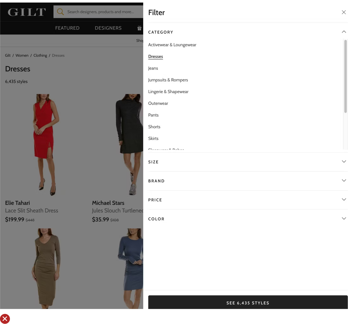
UX Guideline 16. Offer Category-Specific Filters for All Essential Product Specifications
Issue: A lack of detailed filters hampers product finding, making it tedious and inefficient for users to locate desired products.
Advice: To streamline user navigation, provide category-specific filters for each type of product available.
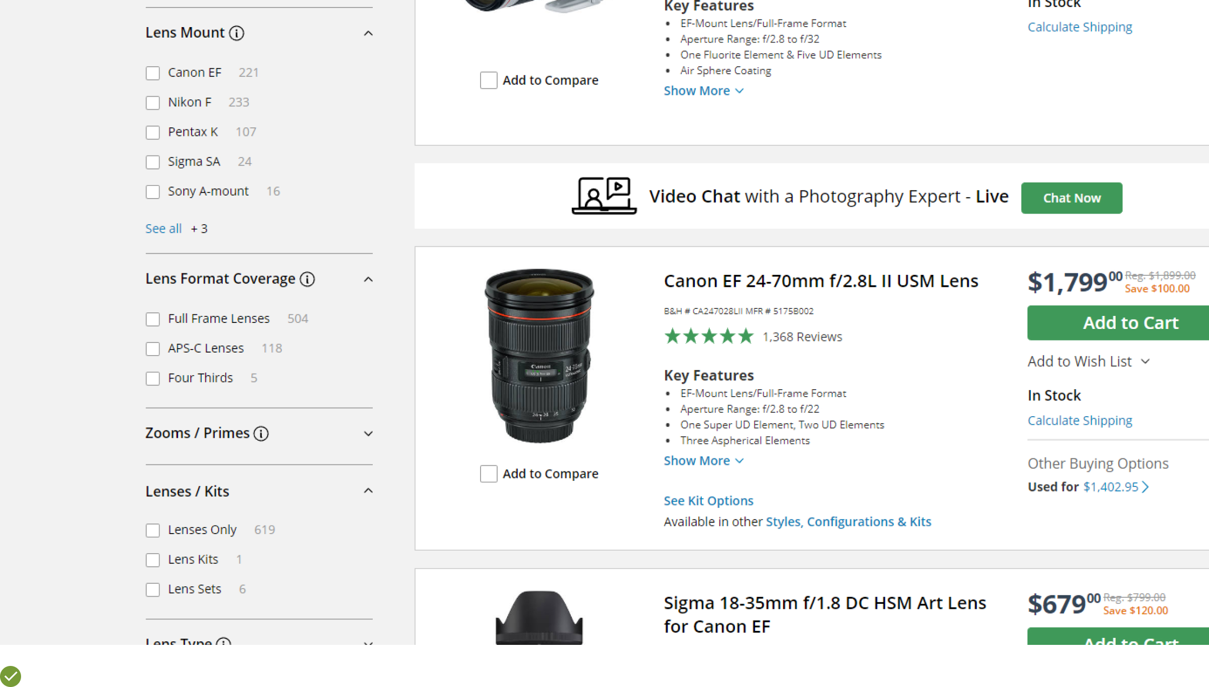
Example: On B&H Photo, novice photographers can easily understand the critical aspects of camera lenses by viewing the filter types. This allows them to refine their search until they identify the lenses that match their preferences.
UX Guideline 17. Implement Compatibility Filters for Products that Require Compatibility
Issue: Failing to provide compatibility information can hinder the purchasing process, as users may not proceed with purchases if they are uncertain about product compatibility.
Advice: Ensure that all products that depend on compatibility, such as accessories for specific devices, have compatibility-based filters.
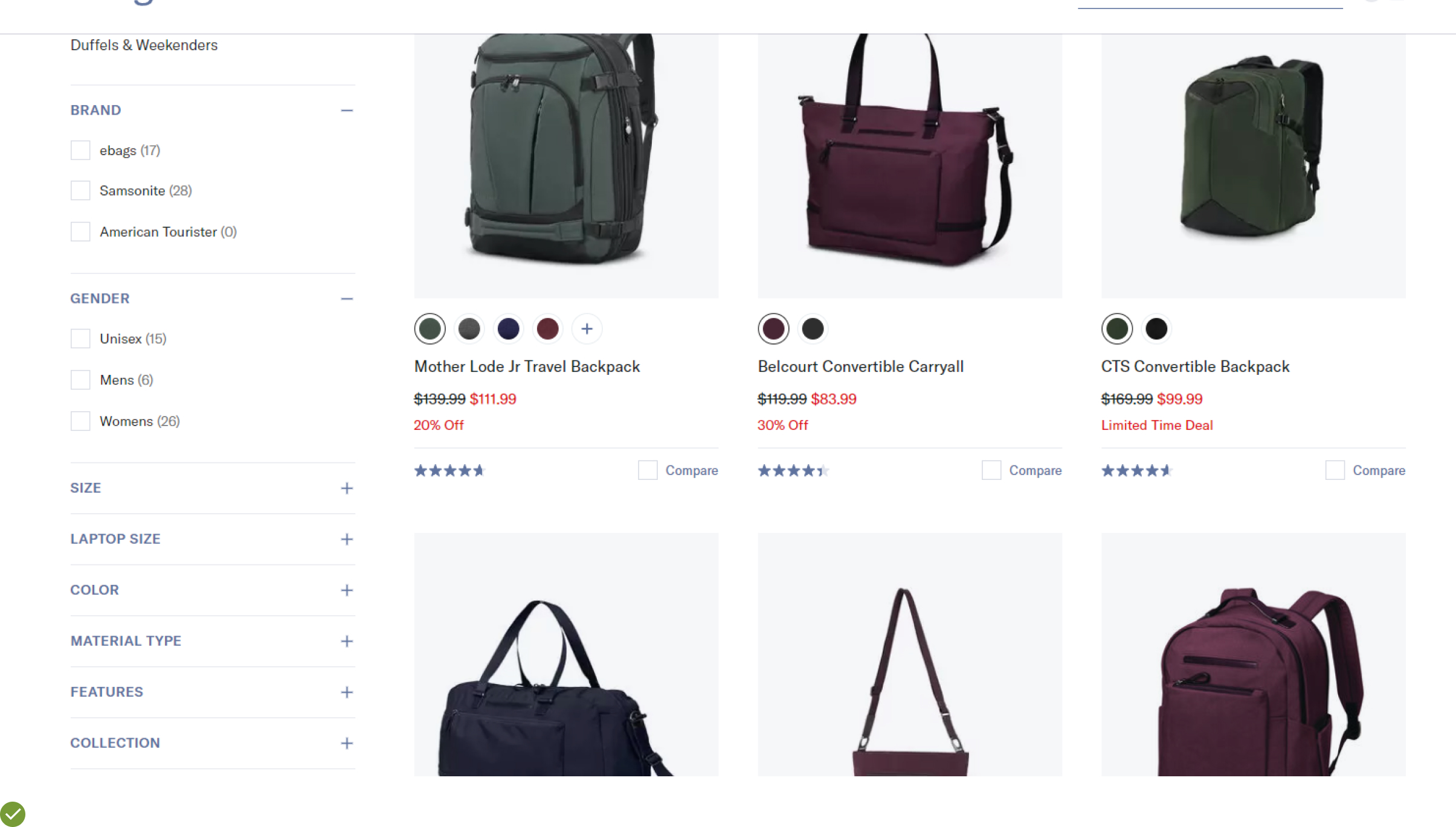
Example: eBags has a “Device Type” filter that allows users to quickly find laptop bags and cases suitable for their devices. Such a filter greatly reduces the time spent searching for compatible products, boosting user satisfaction.
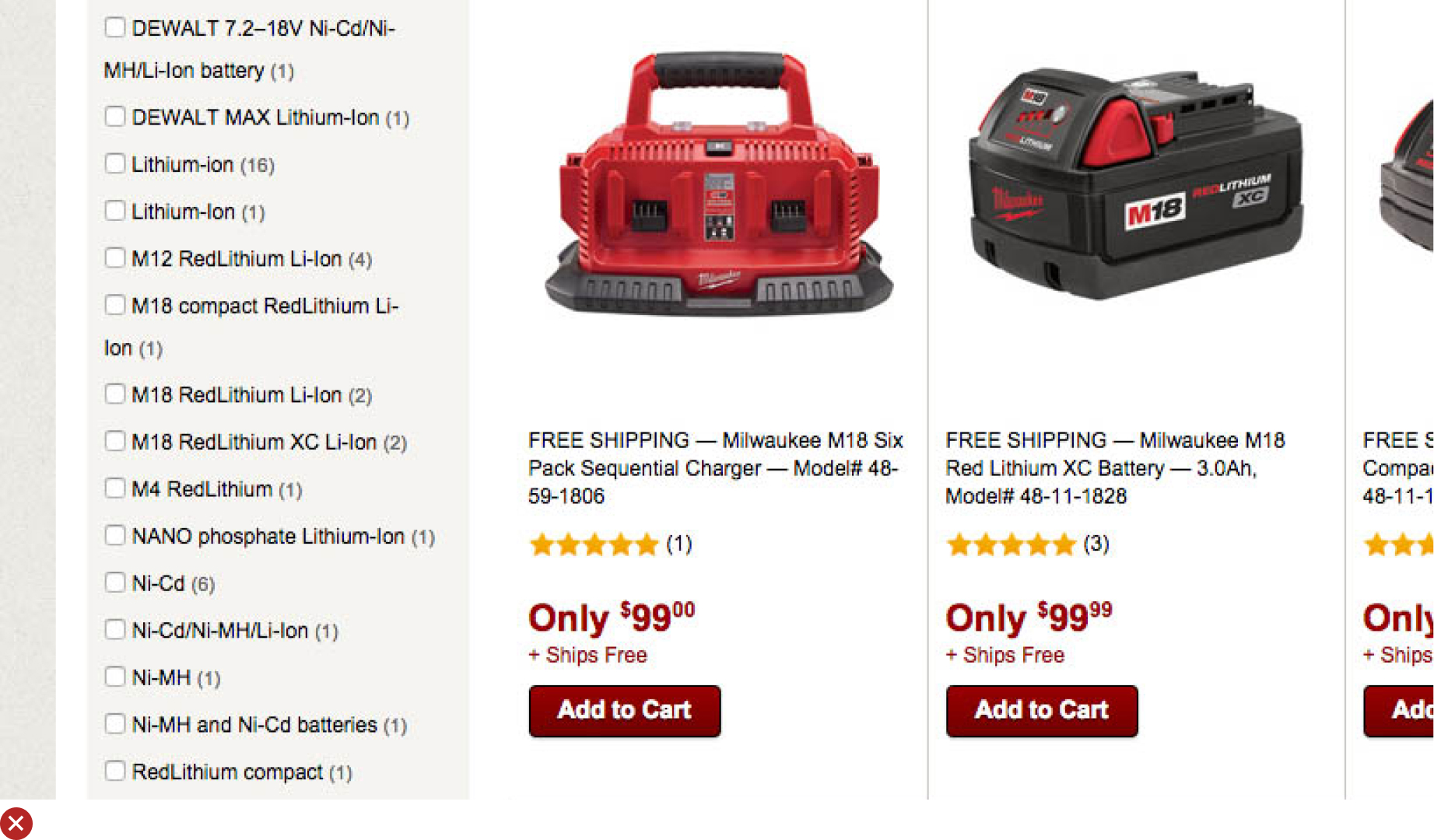
UX Guideline 18. Decode Industry-Specific Filters
Issue: Filters containing industry-specific terms can be challenging to understand and potentially misleading for users.
Advice: It’s essential to simplify or thoroughly explain industry-specific filters. For filters that rely on visual aspects, use visual aids for illustration.
When filters contain jargon or terms that may be ambiguous, consider these approaches to improve understanding:
- Avoid jargon where possible and use terms that users are more likely to recognize and understand.
- Provide clear explanations for industry-specific or ambiguous filters if they’re essential or valuable to expert users.
- Offer visual examples for filters that are visually driven, using thumbnails to represent differences rather than relying on text descriptions.
Example: Build.com offers detailed tooltips for each filter type, ensuring users fully comprehend what each filter entails.

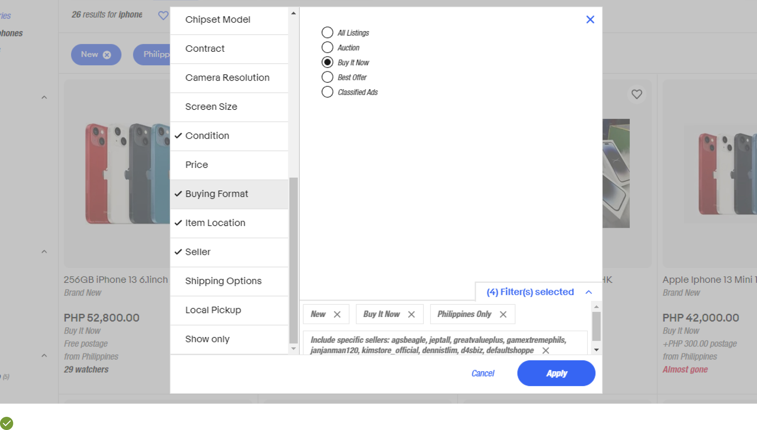
UX Guideline 19. Facilitate Multiple Filter Options of the Same Type
Issue: Shoppers may experience frustration if they can’t choose multiple filter options within a single category, which could impede their product search and increase their chances of abandoning the cart.
Advice: Enable your customers to select more than one filtering option within the same category. This feature will enhance the shopping experience by producing personalized and relevant product lists, thus promoting higher conversion rates.
Example: Consider how Walgreens permits customers to apply several filters within the same category, crafting a customized product list that matches their specific needs.
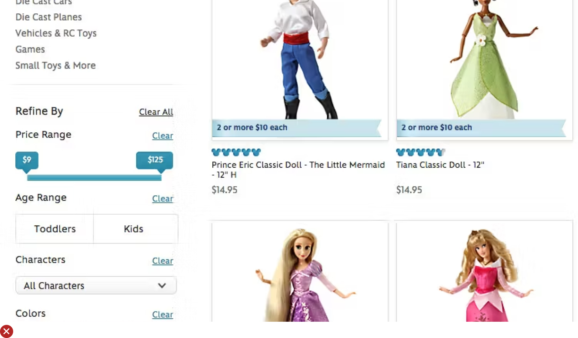
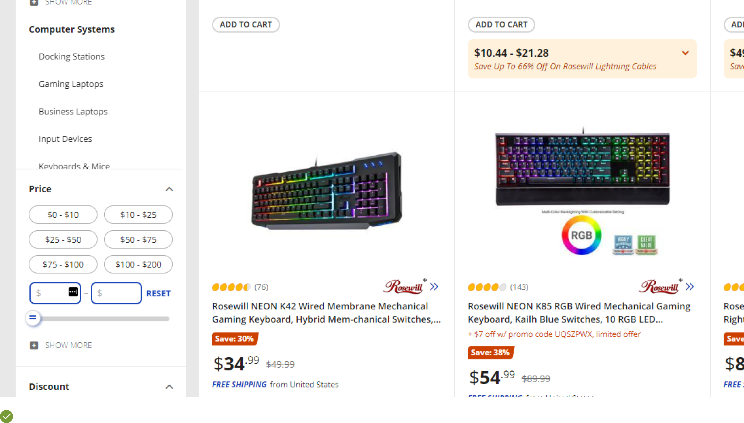
UX Guideline 20. Provide User-Defined Ranges for All Numeric Filters
Issue: Standard numeric range filters often fall short of individual user requirements, resulting in an inefficient browsing experience.
Advice: Empower users by providing both predefined and user-defined range filters for numeric values. This flexibility allows them to refine their search to their specific needs and enhances their browsing experience.
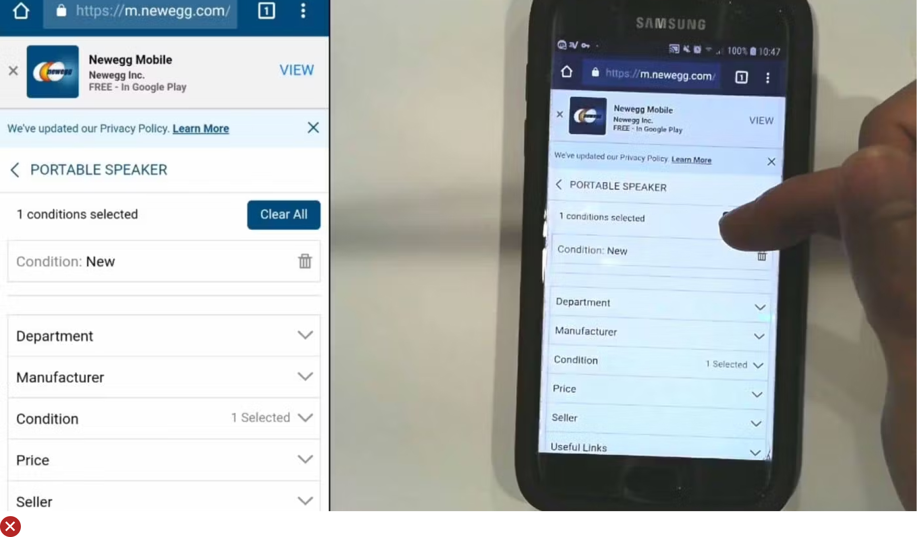
Example: Take inspiration from Newegg’s user-defined price range feature, allowing users to circumvent the predefined ranges and curate a more tailored product list, improving the customer journey and boosting sales potential.

UX Guideline 21. Truncate Filters with 10+ Values
Issue: Without an idea of the total number of products on a list, users might be left feeling overwhelmed or frustrated, potentially leading to an unsuccessful shopping experience.
Advice: Always disclose the total count of items in the product list. This transparency helps customers understand the quantity of products and can aid in refining their search. Ensure this number is easily recognizable, without being a distraction.
Example: Neiman Marcus efficiently displays the number of items at the top of the product list, under the filters. This strategic placement clearly communicates the list’s scope, enhancing user experience.
UX Guideline 22. Deploy “Thematic” Filters for Relevant Product Types and Categories
Issue: Digital storefronts that solely rely on physical product attributes for filters often fail to accommodate shoppers’ browsing habits developed from in-person shopping experiences.
Advice: Implement “Thematic” filters that reflect your website’s context and product catalogue. These filters guide users in a more intuitive and familiar way, and provide a richer browsing experience, encouraging purchases.
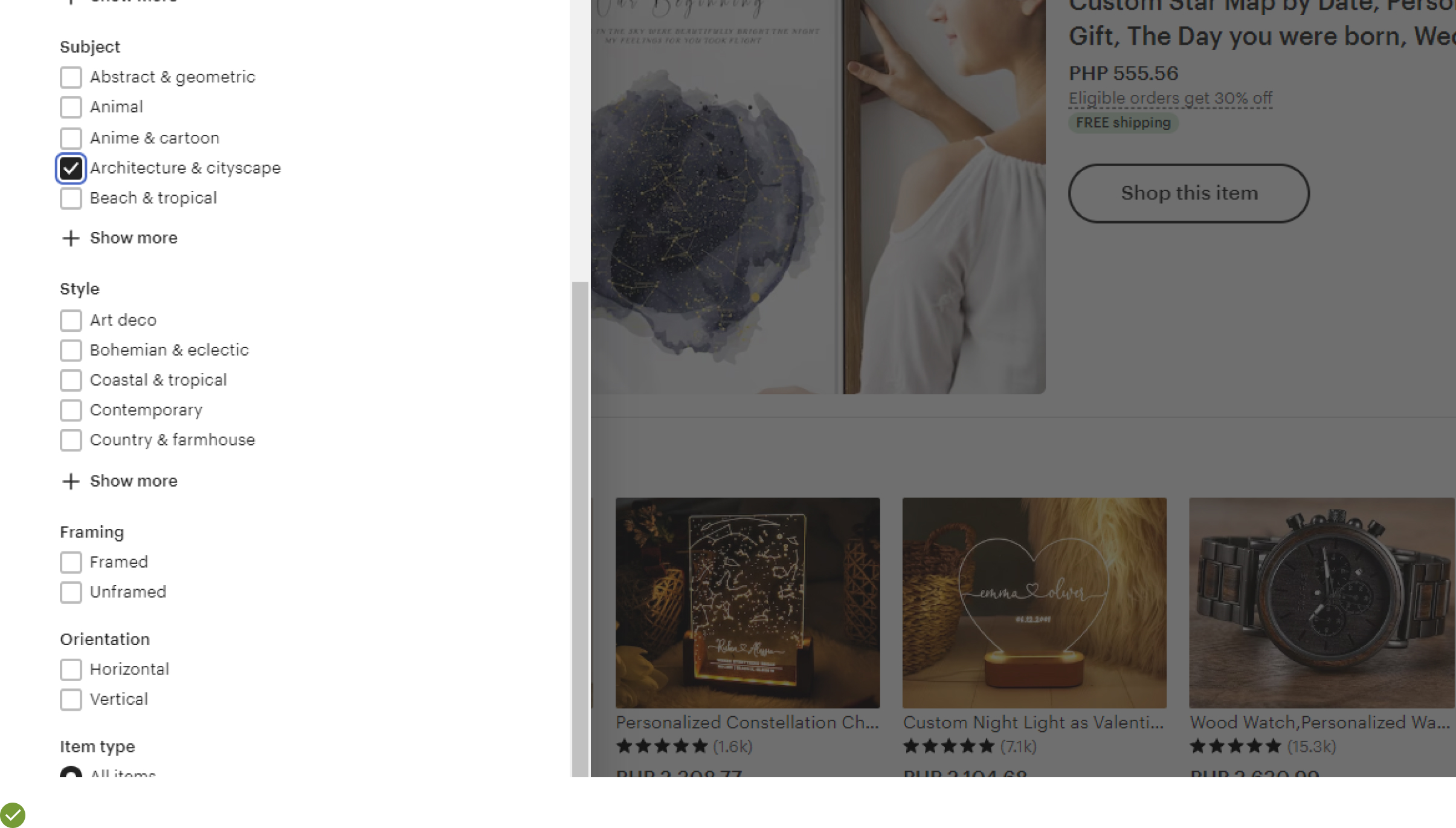
Example: Etsy offers users searching for furniture various “Thematic” filter options such as “Minimalist” or “Rustic & primitive.” These thematic filters simplify the shopping experience, particularly for users unfamiliar with interior décor terminology, and help drive higher conversion rates.
Mastering Product List & Filtering UX
In the aftermath of applying essential UX guidelines to ‘Product List & Filtering’, envision the outcome once again – customers seamlessly exploring your WooCommerce store, comfortably browsing through product categories, and effortlessly finding their desired products.
The satisfaction on their faces now translates to successful transactions and an increased conversion rate on your end.
Understanding and applying UX essentials is not just an improvement; it is a fundamental necessity in today’s digital market.
Now, equipped with the knowledge of these guidelines, you have the power to turn your online store into an intuitive, user-friendly marketplace.
By mastering this art, you can ensure your visitors stay, find what they need, and turn into happy, returning customers.
