

Imagine gazing at a picture of a modern, digital-savvy mom, awake during the wee hours, nestled with her peaceful baby.
Her face softly illuminated by her mobile device screen, she is browsing through a wonderfully engaging and intuitive e-commerce platform.
The shopping cart on her screen, already brimming with items, is a testament to the smooth user experience she’s enjoying.
This captivating image encapsulates the secret weapon of the online store she’s browsing – a superior User Experience (UX).
Far from a ‘nice-to-have’, effective UX is a strategic advantage crucial for achieving superior conversion rates and outperforming competitors.
It’s what stops your WooCommerce store from leaking sales like a sieve.
With its power to influence both High Intent and Low Intent shoppers, UX sits at the centre of the shopping experience.
Especially important here are the homepage and navigation – the first points of contact for customers.
This post will delve deeper into the UX guidelines and themes that can transform your e-commerce platform into a conversion powerhouse, just like the one our night-owl mom is enjoying.
Essential Homepage & Navigation UX Guidelines
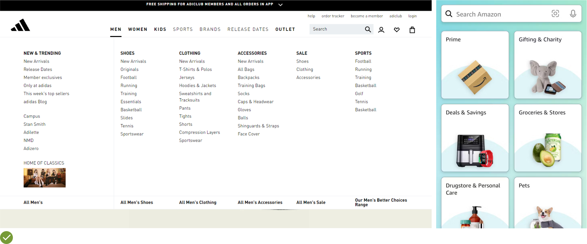
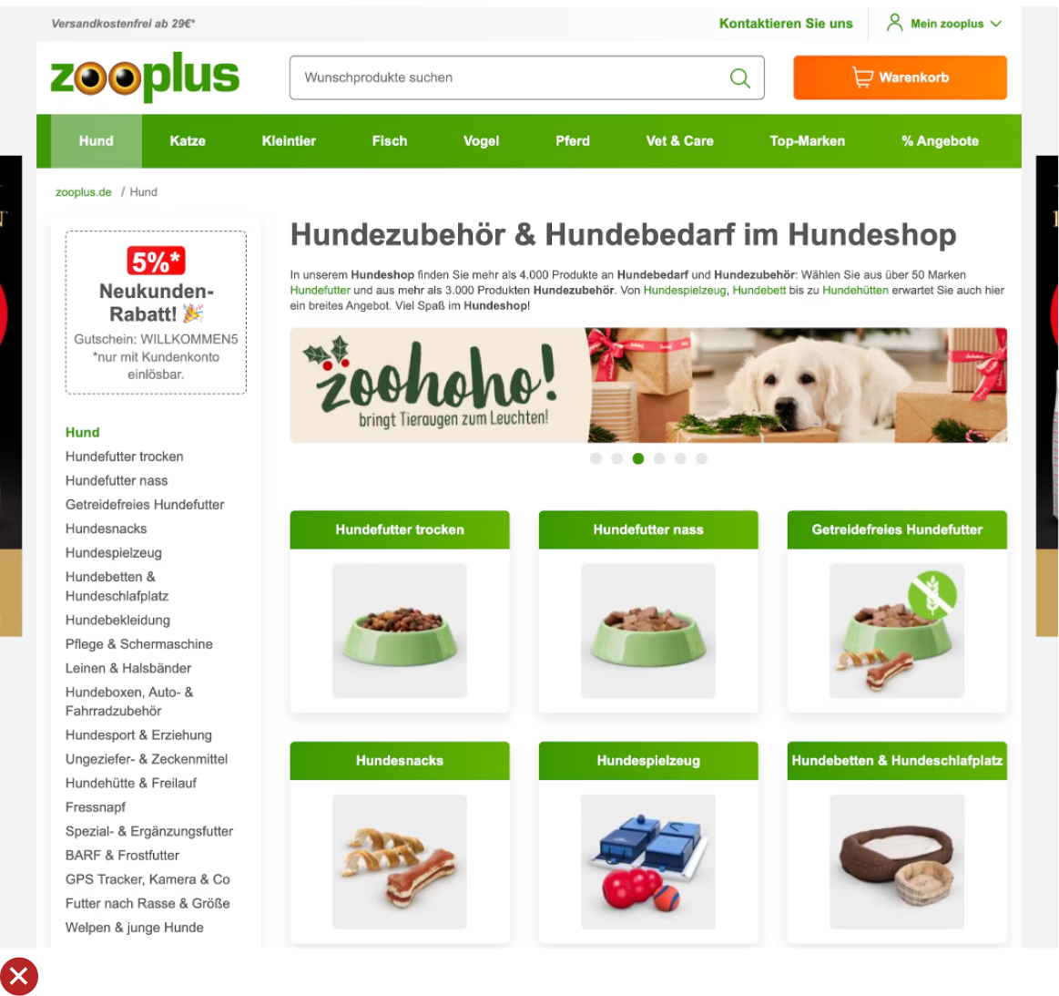
UX Guideline 1. Prioritize Product Categories in Main Navigation
Issue: The usage of a singular main navigation item, such as “Products,” that includes all product categories can cause undue complexity in the top hierarchy and impede product browsing.
Advice: Directly display product categories (e.g., “Men’s”, “Women’s”, “Electronics”) as the top layer of the main navigation. This should be immediately visible on desktop without hovering, and quickly accessible upon opening the main navigation on mobile.
Example: Businesses like Samsonite ensure clear navigation by featuring first-level product categories, such as “Business & Laptop Cases”, prominently in their main navigation.
UX Guideline 2. Differentiate Sitewide Courtesy Navigation from Main Product Navigation
Issue: Courtesy navigation can lead to clutter and confusion in the main navigation, inhibiting easy browsing of products.
Advice: Separate the sitewide courtesy navigation visually from the main product navigation and categorize it into thematic sections. Commonly needed options like “Sign In”, “Create Account”, “Help”, “Contact / Customer Service”, “Store Locator”, and “Track an Order” should be included in the courtesy navigation.
Example: Northern Tool excels at grouping related courtesy navigation options, such as customer support phone number and chat, separate from other courtesy options.

UX Guideline 3. Aid User Selection of a Well-Defined Scope
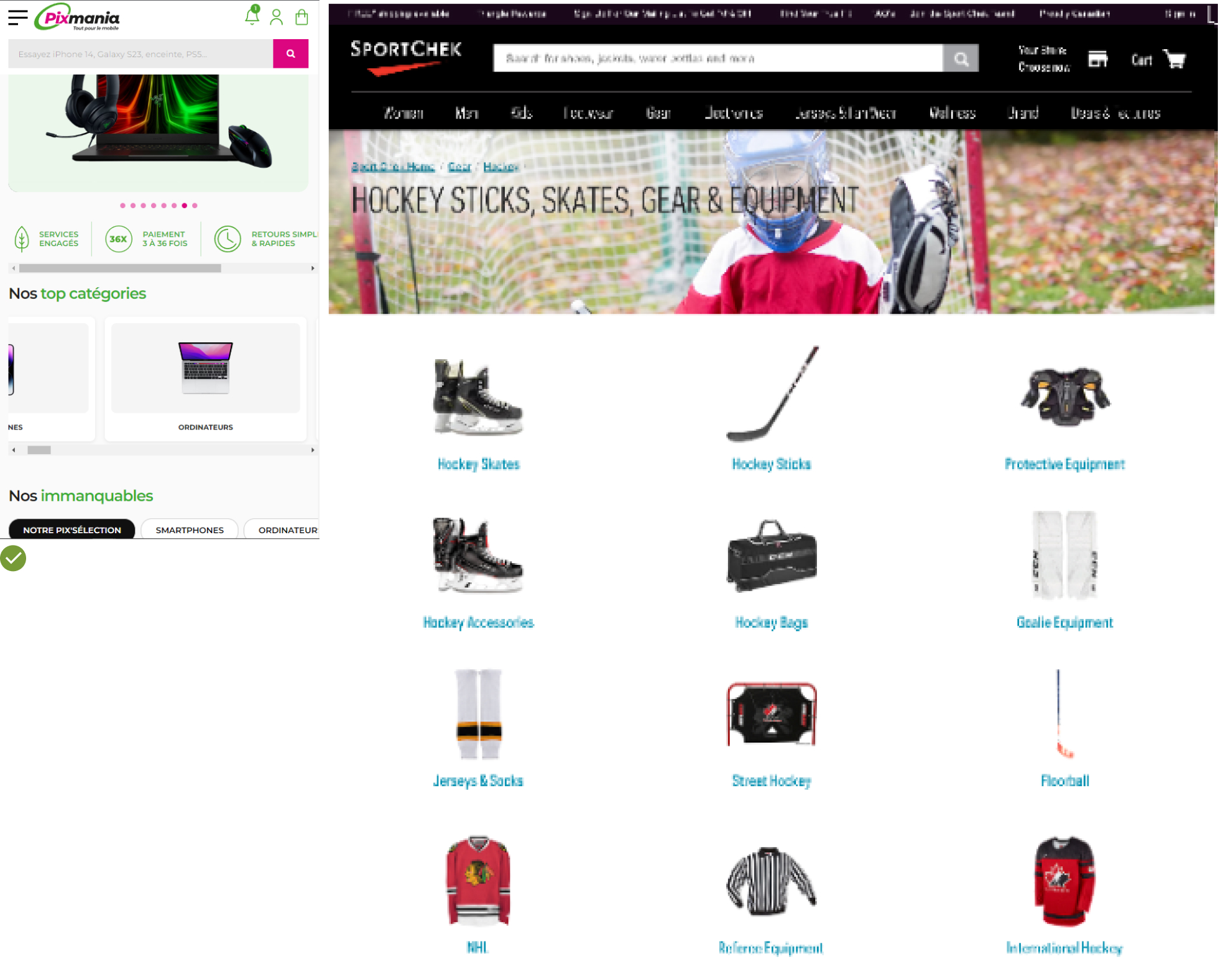
Issue: When the homepage doesn’t assist users in defining their scope, they may be compelled to delve into the site’s category taxonomy, often resulting in inefficient and roundabout navigation.
Advice: Aid users in making well-defined scope selections right from the homepage. Promote popular categories and sub-categories or use wizards to guide the user journey.
Example: Pixmania efficiently promotes popular categories and sub-categories directly on their homepage, enabling users to swiftly enter the “Digital Cameras” sub-category.
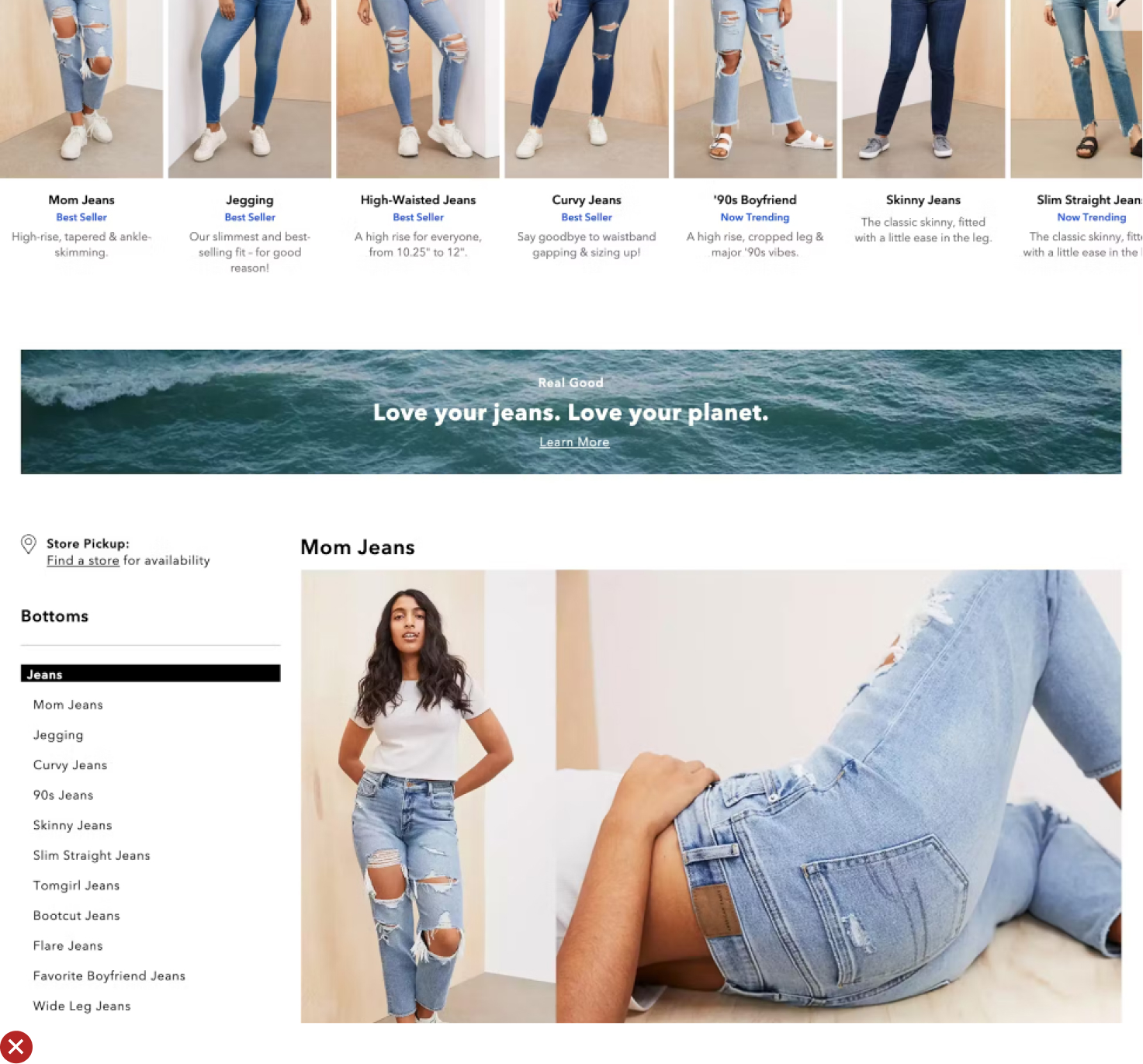
UX Guideline 4. Display Clear, Representative Subcategory Thumbnails
Issue: Text-only links can be challenging to scan and provide limited information. Misinterpretation can occur with some subcategory thumbnails.
Advice: Always include subcategory thumbnails on intermediary category pages on both desktop and mobile platforms. These thumbnails should be clear, representative, and quickly interpretable.
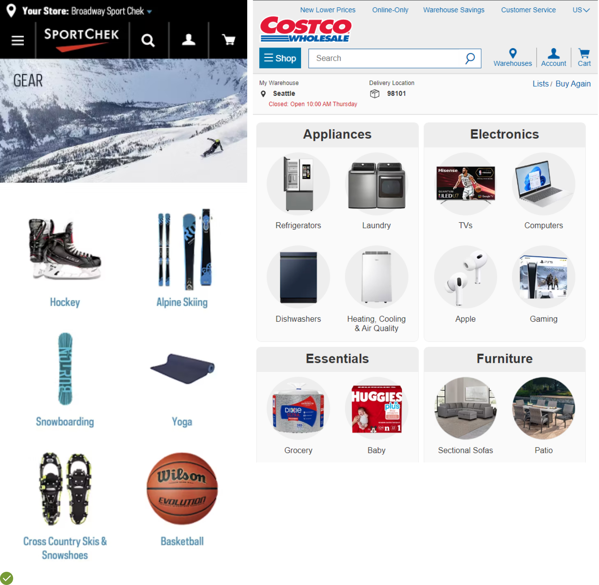
Example: Costco effectively uses subcategory thumbnails on their intermediary category pages to clarify the product type each subcategory contains, either by isolating the product from its typical context or focusing the image to avoid misinterpretation.
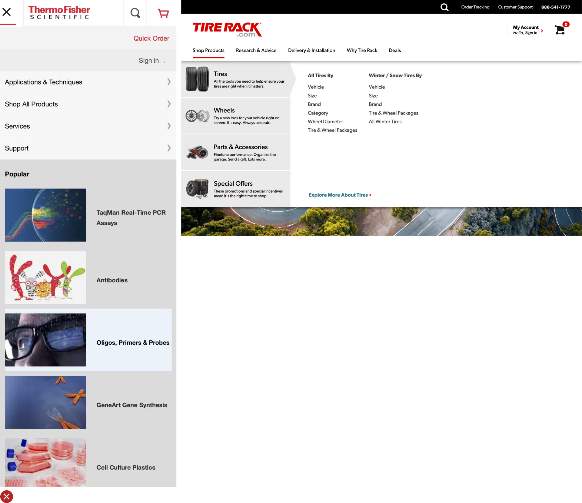
UX Guideline 5. Employ Intermediary Category Pages in the Top Levels of Site Taxonomy
Issue: When top hierarchy levels lead directly to product-listing pages, users may struggle to select an appropriate scope, resulting in either excessively broad or overly narrow product lists.
Advice: Implement the first 1-2 levels of your navigation hierarchy as intermediary category pages. A third level can be considered if it offers additional scope definition that benefits the users.
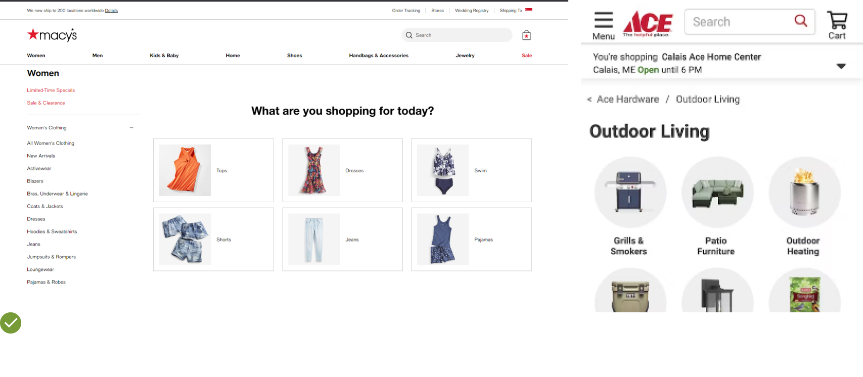
Example: At Macy’s, an intermediary category page under “Men” was introduced to aid users in defining their scope before browsing products, preventing too broad or vague searches.
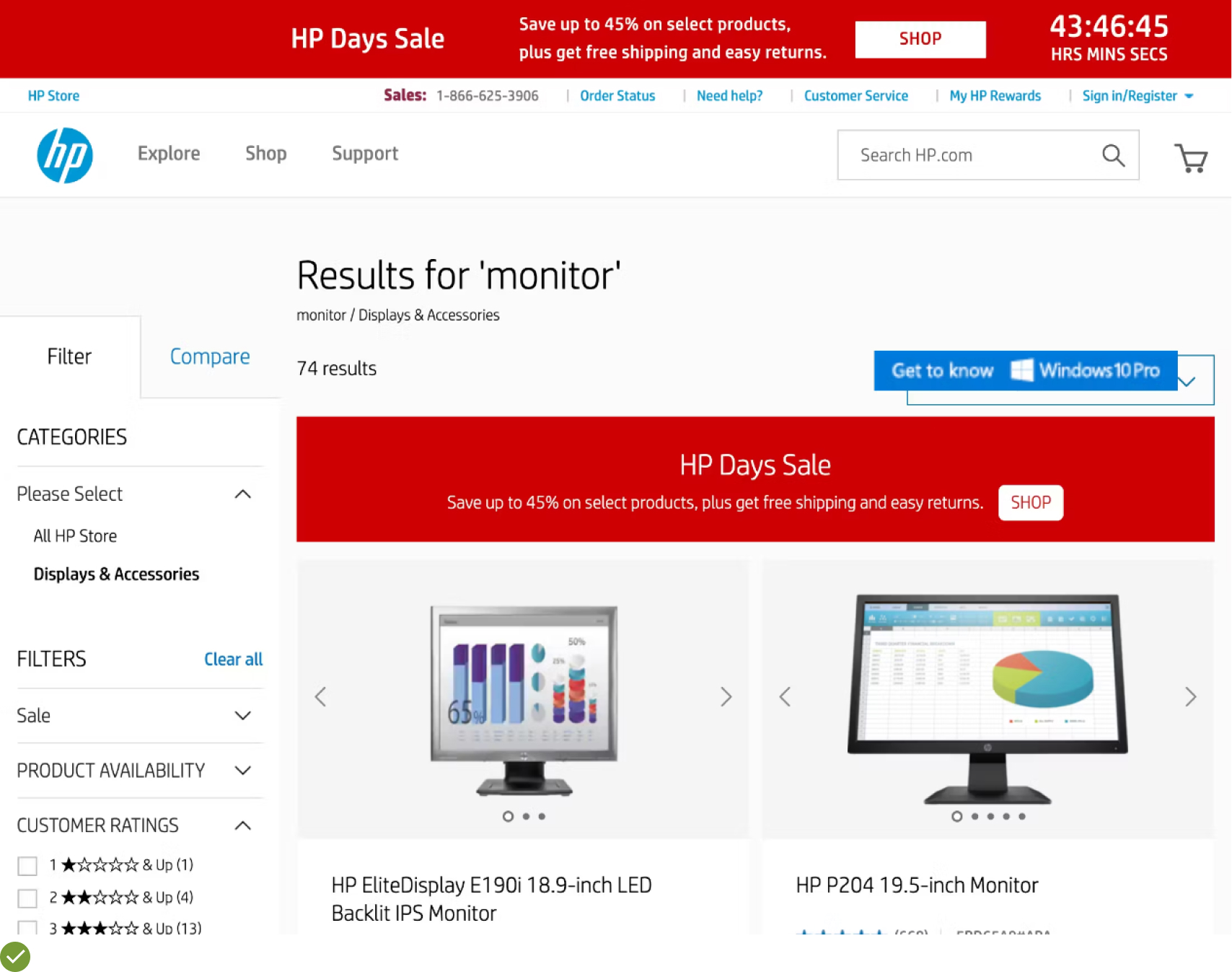
UX Guideline 6. Utilize Filters for Product Types with Shared Attributes
Issue: Product discovery can be hindered when elements better suited as filters are implemented as categories.
Advice: Use filters for product types, rather than categories, when most product attributes (e.g., “brand” and “style”) are the same across the product type. Conversely, use categories for product types that don’t share most attributes and are thus mutually exclusive.
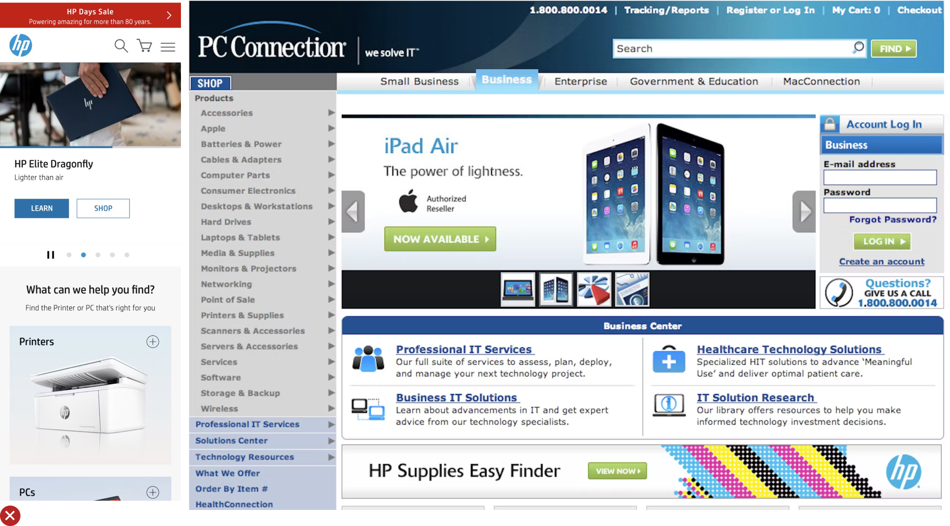
Example: HP correctly employs product types and features as filters instead of categories, allowing users to view and compare similar items like “Intel Core i3” and “Intel Core
From Leaky Bucket to Gold Mine: Transforming Ecommerce with UX
Well-crafted homepage and navigation are the cornerstones of a successful ecommerce platform.
They play a critical role in directing customers to the product categories that interest them the most.
A usable homepage can remarkably boost order values, with customers more likely to purchase multiple products from diverse categories.
As business owners, entrepreneurs, or ecommerce enthusiasts, we need to recognize the significant strategic advantage that a robust UX design can offer.
In essence, a WooCommerce store with solid UX isn’t just a store; it’s a well-organized digital marketplace that guides customers to their needs and desires efficiently.
Remember, in the world of ecommerce, User Experience isn’t just about usability—it’s about creating an experience that makes customers want to return.
