
Picture the marketplace of your dreams: customers enthusiastically filling their carts, each click echoing their anticipation of owning new, unique treasures.
Yet, when they reach the checkout, the process becomes a labyrinth of confusion, leading to abandoned carts and a shift of loyal customers to your competitors.
This is the common reality of e-commerce usability.
However, imagine an alternate reality – a place where every interaction is smooth and intuitive, where every step of the checkout process is a beautifully choreographed dance leading to a joyful crescendo of completed transactions.
This is not just a dream, but a reality that can be achieved with a well-crafted UX design for your online store.
Cart & Checkout UX are an essential part of The Importance of Good UX in E-Commerce to Maximize Conversion Rate.
The following 38 research-backed UX Cart & Checkout guidelines can transform your site from a ‘leaky bucket’ to a ‘brimming well’ of customer satisfaction.
Cart & Checkout UX Guidelines
UX Guideline 1. Avoid Interrupting Checkout with Feedback Requests
Issue: The checkout process is a critical moment where distractions can lead to cart abandonment, costing potential sales. Interruptions such as feedback requests divert customers’ attention from completing the order.
Advice: Maintain a clean and distraction-free checkout flow. Avoid implementing any survey or feedback requests during checkout. If live chat is used, let it be user-initiated, except in cases of repeated validation errors.
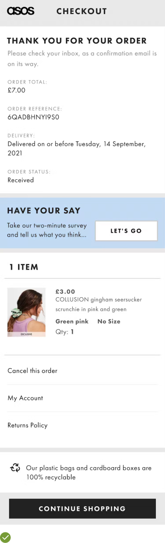
Examples: ASOS effectively handles feedback by providing a survey link on the order confirmation page, only after the checkout process is complete. This ensures no disturbances during the critical checkout phase.
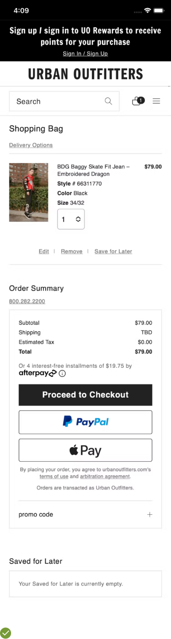
UX Guideline 2. Incorporate a ‘Save for Later’ Feature
Issue: Shoppers often use their carts for potential purchases but are not ready to buy everything immediately. Without an option to save items, users may have to remove them to proceed with the desired purchase.
Advice: Introduce a ‘Save for Later’ feature. Ensure it does not autoscroll when users click ‘save’, to prevent unwanted navigation. Be aware of fold issues when placing the ‘Saved Items’ section on the cart page, and provide a link to it within the user’s account pages.
Examples: Urban Outfitters’ mobile app separates saved items in a clear “Saved for Later” tab within the cart, offering an easy way to access them later.
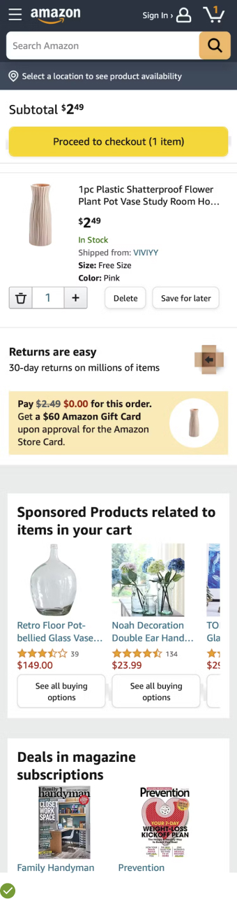
UX Guideline 3. Optimize Cart for Product Comparison & Storage
Issue: Some customers use their carts as a storage or comparison tool. If the cart design doesn’t support this, users may struggle to review and compare their selected items.
Advice: Design the cart to facilitate product comparison and storage. This includes featuring large product thumbnails, incorporating core specs, providing links back to product pages, ensuring cart content persistence, and allowing cart content to be shared on mobile platforms.
Examples: Amazon’s cart setup is an ideal model, offering clear product thumbnails, core specifications, links back to product pages, and cart content persistence.
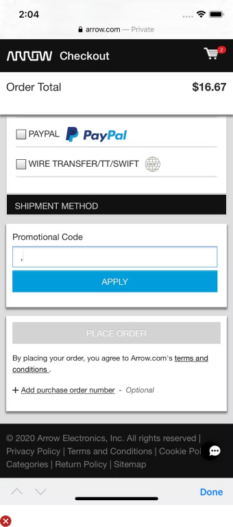
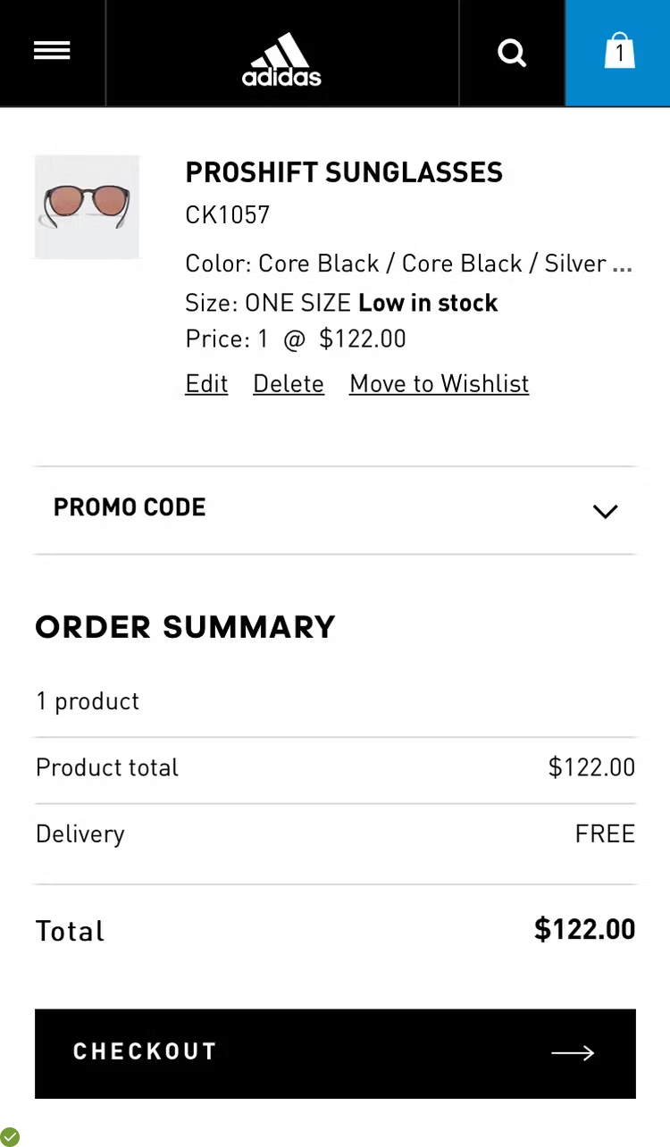
UX Guideline 4. Conceal Promotional Code Fields Behind a Link
Issue: Visible promotional code fields can distract users and even encourage them to leave the checkout process in search of coupons, potentially leading to lost sales.
Advice: Hide coupon and promotional code fields behind clickable links. These links should be placed subtly, not diverting from the primary task – the checkout process.
Examples: Adidas effectively manages this by giving an option to apply a promo code at the cart and payment step. However, the field is collapsed, reducing its emphasis and preventing unnecessary distractions.
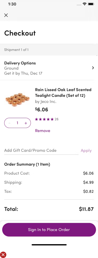
UX Guideline 5. Display Full or Estimated Order Cost in the Cart
Issue: Shoppers want to know the total cost, including shipping, taxes, and other fees, before proceeding to fill out detailed checkout forms.
Advice: Present the full or estimated cost within the cart. It should include all the extra costs like shipping, taxes, and fees. If shipping is free, explicitly indicate this within the cart summary.
Examples: Many ecommerce platforms, including Amazon and Walmart, provide full cost breakdowns in the cart, making it clear for users what they’ll pay before they proceed to checkout. If free shipping is offered, it is clearly stated, reassuring users that they are receiving the expected deal.
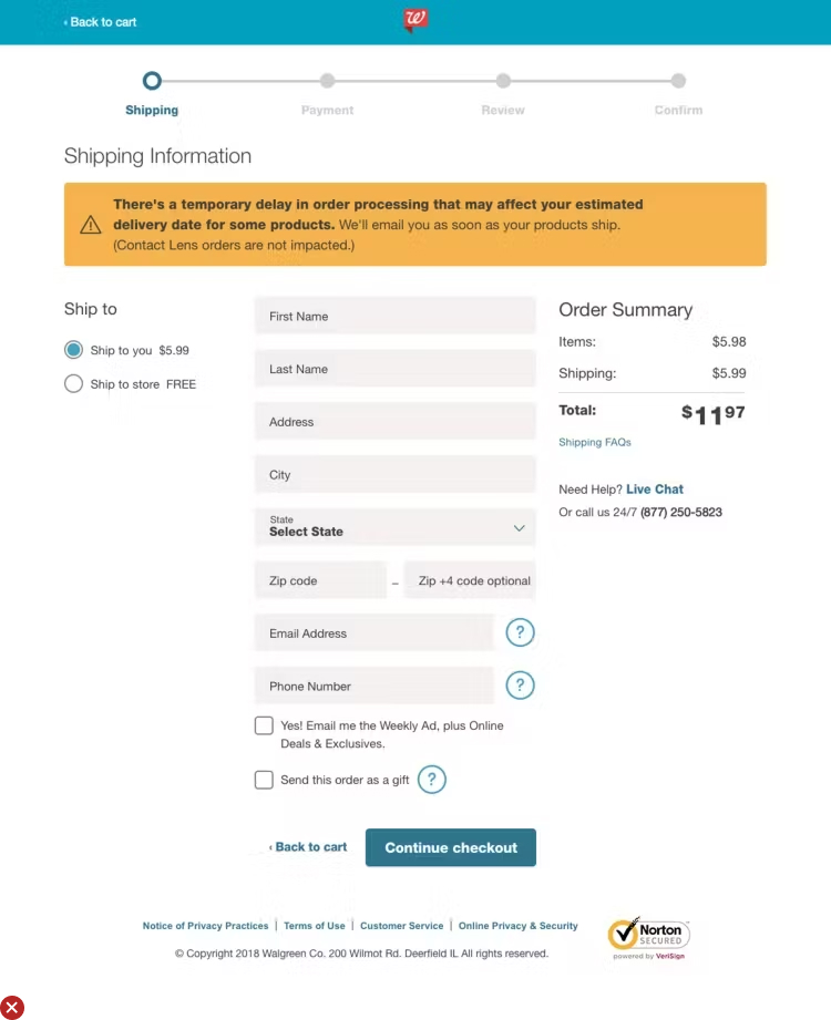
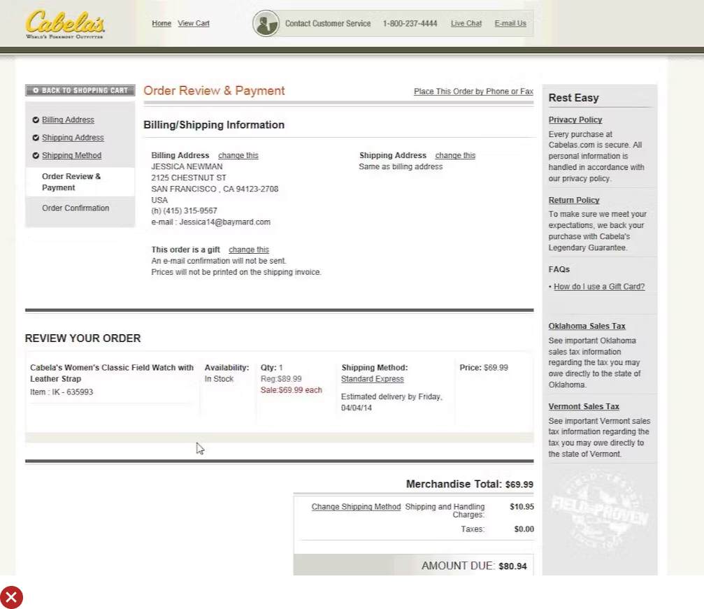
UX Guideline 6. Dangers of Conventional Multi-Page Checkouts
Issue: Multi-page checkout flows can confuse users due to lack of control and understanding of the overall process, leading to problems when trying to edit their order details.
Advice: If you’re utilizing a multi-page checkout process, ensure all steps are clearly signposted, highlight the review step distinctively, and enable easy editing of order data without navigating backwards.
Example: Ecommerce sites like Amazon present a clearly indicated step-by-step checkout process, enabling users to modify order details at any point without having to backtrack, offering a smooth and effective user experience.
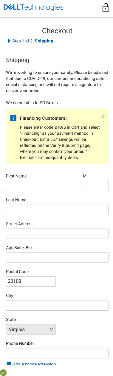
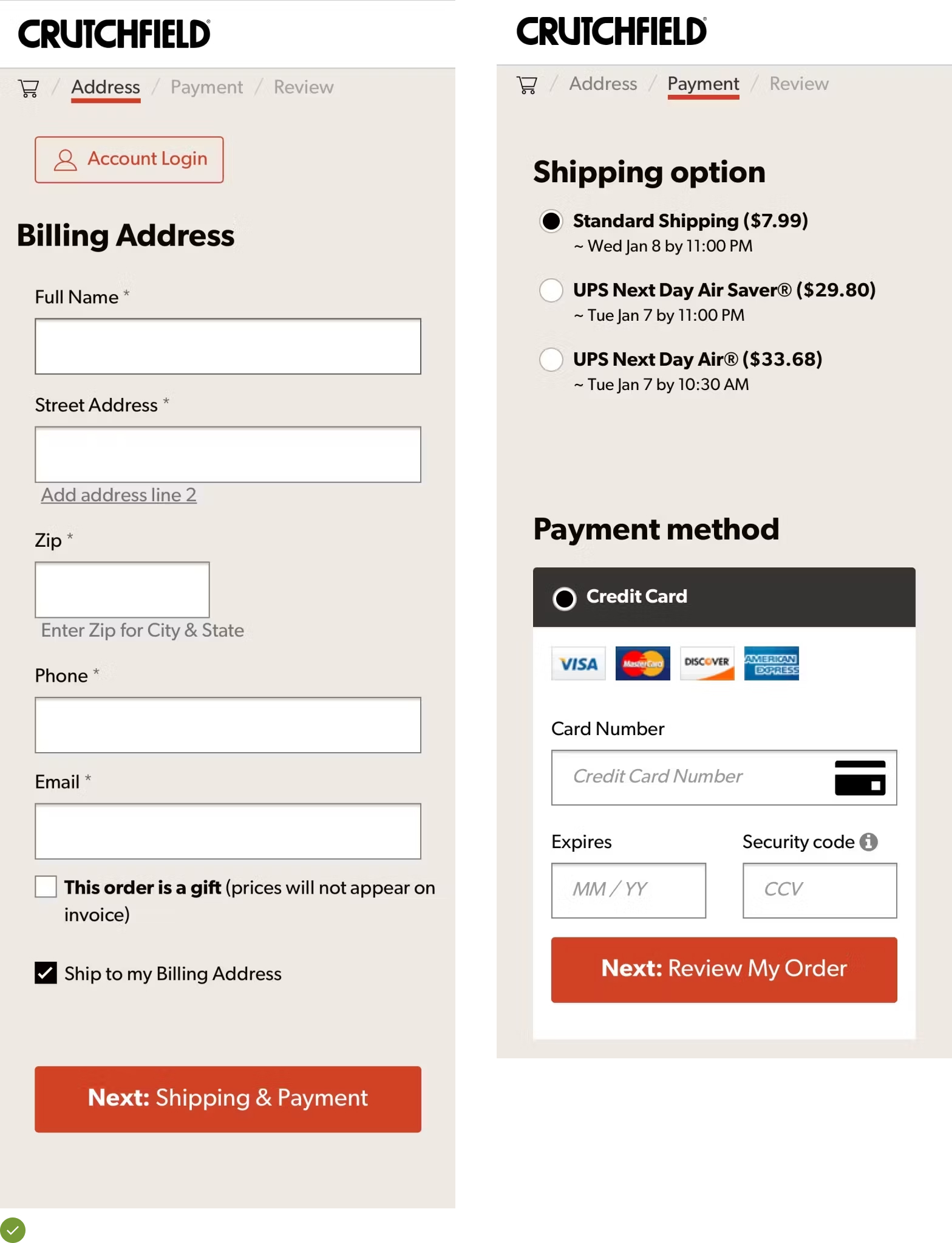
UX Guideline 7. Matching Checkout Process Steps
Issue: The checkout process can become disorienting for users if their progression isn’t accurately reflected by the displayed process steps.
Advice: Ensure each action in the checkout flow corresponds exactly with the process step indicators. This includes avoiding merging steps and including often overlooked steps such as cart review, account selection, and order confirmation.
Example: Dell’s ecommerce platform is a good case study as it offers clear alignment between the user’s checkout steps and the process step indicator, enhancing the user experience significantly.
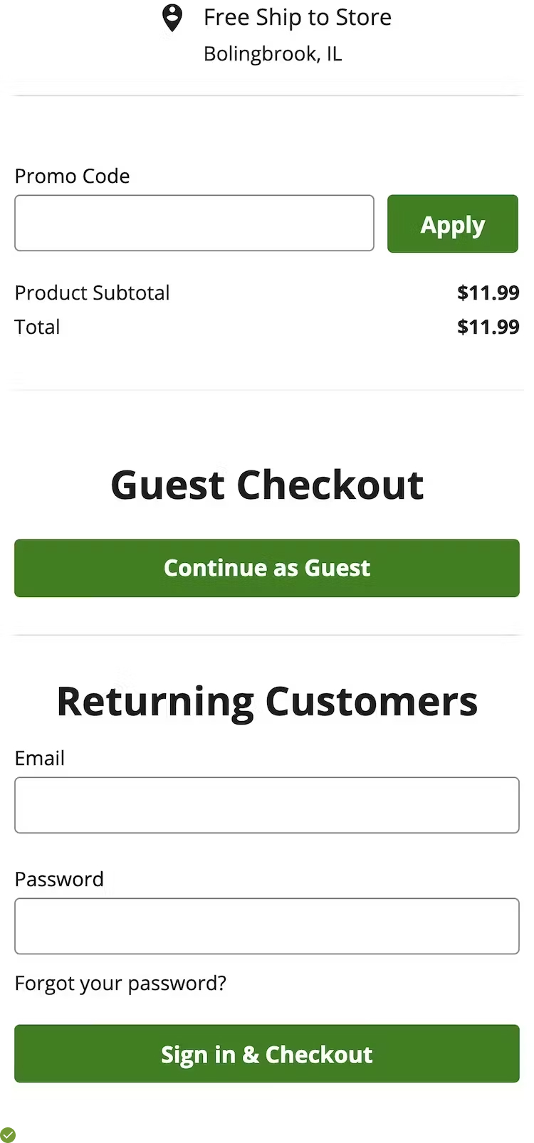
UX Guideline 8. The Necessity of a “Guest Checkout” Feature
Issue: Users typically react negatively to being compelled to create an account just to make a purchase.
Advice: Always provide an option for users to complete their checkout as a guest.
Example: The Home Depot app is a model example as it facilitates guest checkouts, pleasing many users by offering a frictionless shopping experience.
UX Guideline 9. Prioritizing “Guest Checkout” Option
Issue: If users can’t readily find the guest checkout option, it’s as though it doesn’t exist at all, posing a severe usability issue.
Advice: For desktop interfaces, position the “Guest Checkout” option on the left-hand side or the top for single-column layouts. For mobile sites and apps, place it at the top and collapse all options. Ensure visual equality between all options and avoid combined forms.
Example: Top-notch ecommerce sites use progressive disclosure techniques, like displaying all account-selection options in a collapsed state with “Guest Checkout” at the top, offering a clear view of all choices available, thereby reducing friction and confusion.
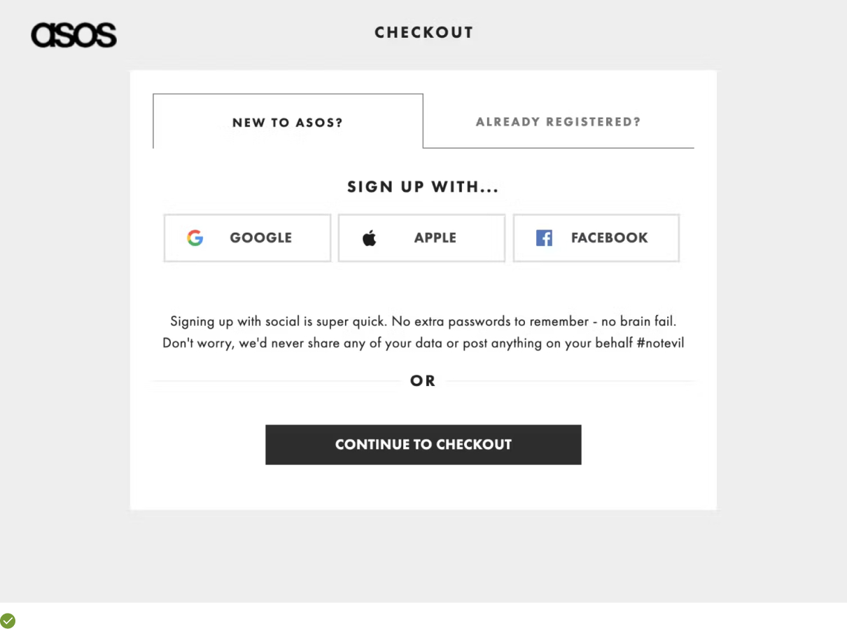
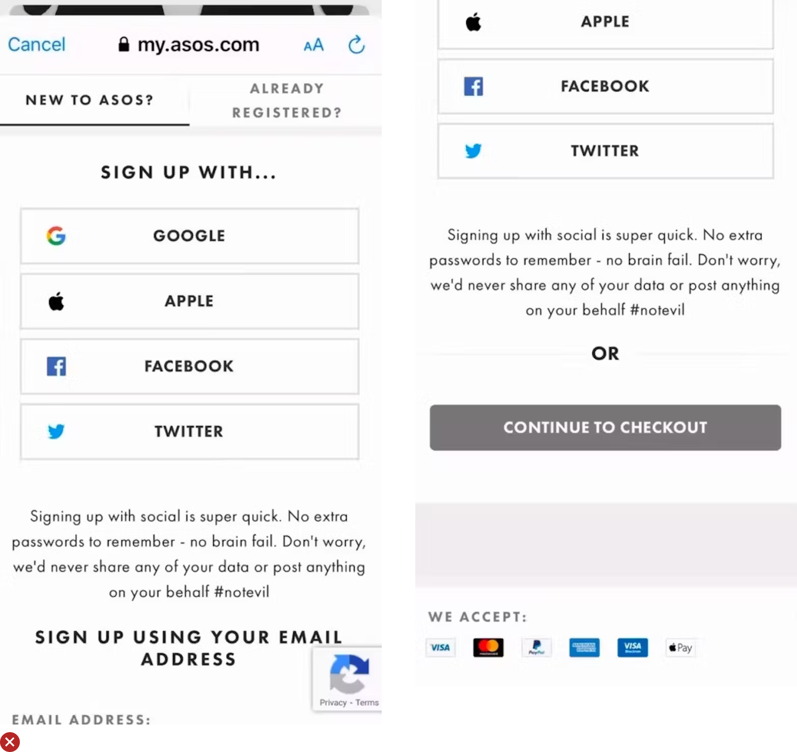
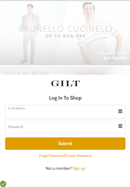
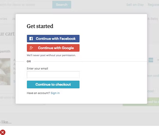
UX Guideline 10. Prioritizing Traditional Email Account Creation over Social Media
Issue: Though a small fraction of users might use social media for account creation, these options can create distractions when deciding whether to create an account.
Advice: Primarily suggest traditional email for account registration. Treat social media-based account creation as secondary, and if provided, clearly specify what the website can and can’t do with the user’s social media account.
Example: On Gilt, traditional email registration is the most visually dominant choice. In addition, Gilt addresses privacy concerns related to social media registration, explicitly stating that they will not post on a user’s behalf without explicit permission.
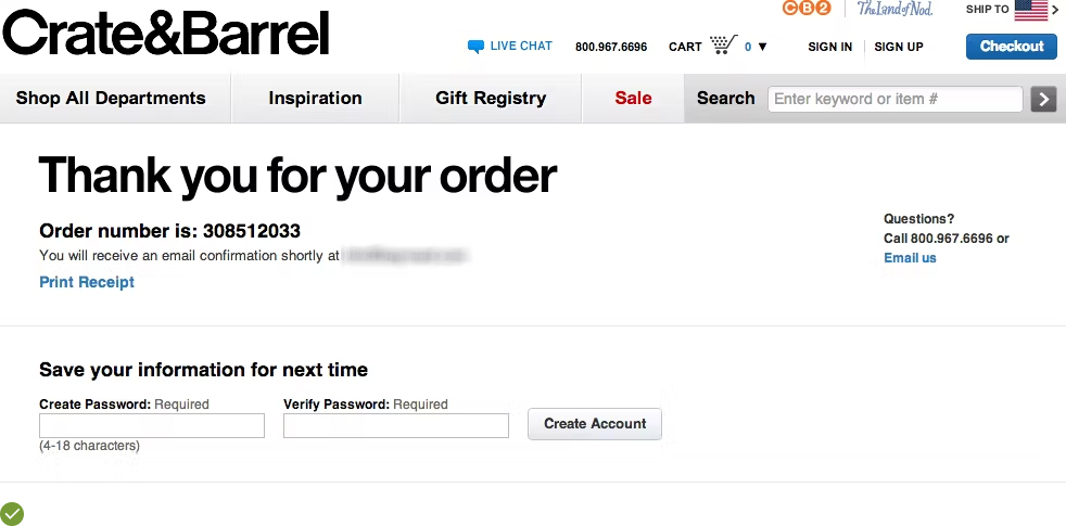
UX Guideline 11. Enhance Checkout Flow by Defering Account Creation
Issue: The checkout process can be disrupted, causing customers to abandon their carts, due to distractions or friction brought on by even optional account creation.
Advice: Position the account creation option at the confirmation step. Make it effortless for customers to create an account, requiring only a password. Assure users who opt for guest checkout that they’ll have an opportunity to create an account post-purchase.
Examples: The likes of successful ecommerce platforms which employ this technique, require only a password for account creation at the confirmation stage. They succinctly outline the perks of account creation, adding to the customer experience.
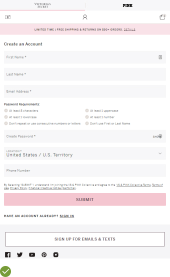
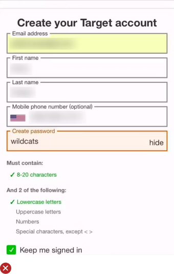
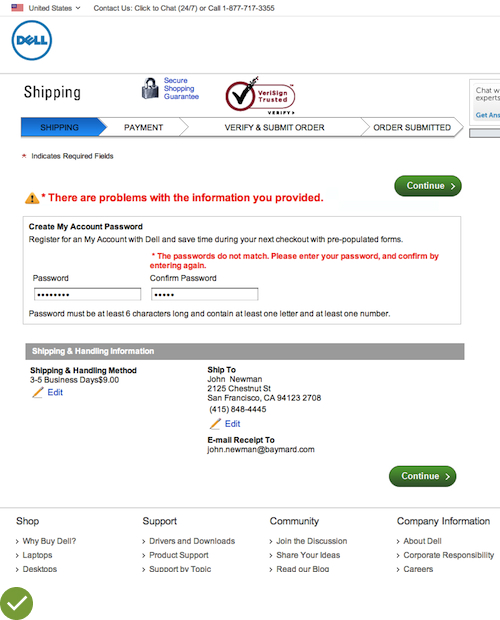
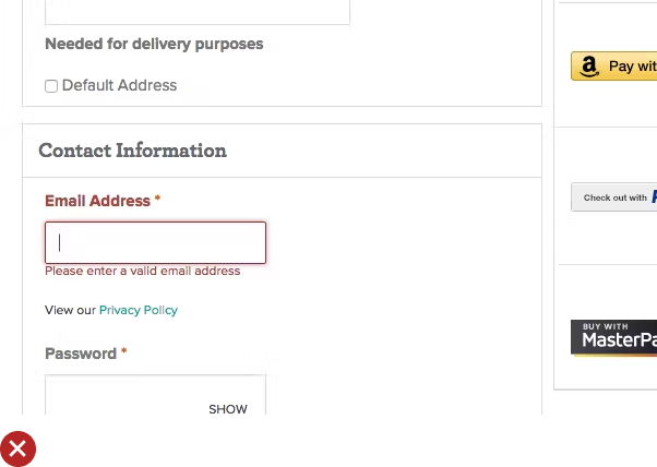
UX Guideline 12. Clearly Specify Password-Creation Requirements
Issue: Unawareness of password requirements can lead to invalid entries. This is due to a lack of standard password conventions across the web.
Advice: Make password requirements clear, placing them near the password field, regardless of the extent of the requirements. Websites with multiple password rules should employ live positive inline validation.
Examples: Online stores like Victoria’s Secret, despite their complex password requirements, utilize live indicators of password requirements. This system aids users in avoiding password errors and mitigates potential frustrations.
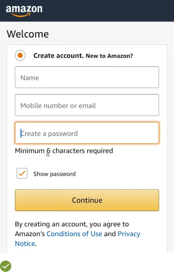
UX Guideline 13. Keep Password Creation Requirements to a Minimum
Issue: Rigorous password rules often lead to customers forgetting their passwords, potentially causing them to abandon their purchases during the reset process.
Advice: While promoting the creation of robust passwords, limit actual requirements to a minimum of 6 characters. Employ other security measures to reduce dependency on technically strong passwords, and permit long passwords of 20+ characters.
Examples: Platforms like Amazon propose guidelines for more secure passwords, but still allow users to proceed with a 6-character password, offering a more flexible and user-friendly approach.
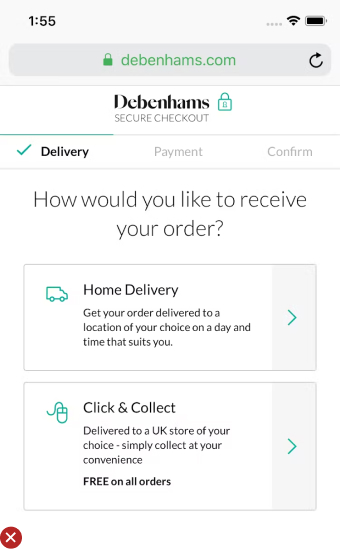
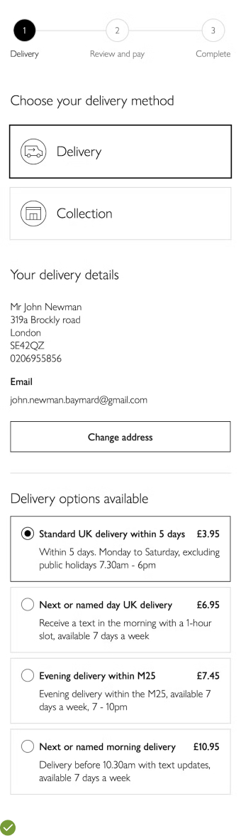
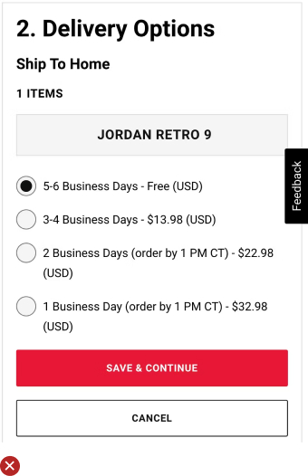
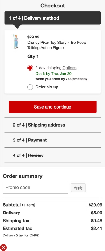
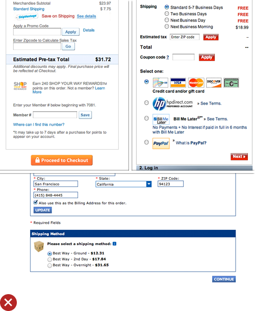
UX Guideline 14. Optimize the Shipping Selector Interface Design
Issue: Inefficient interface designs can hinder customers’ ability to notice, understand, and compare shipping options.
Advice: Avoid using dropdown menus for the shipping selector interface. Ensure proximity and style of information groupings are clear. Highlight price and delivery date, and clearly indicate the selection UI if native radio buttons are not utilized.
Examples: John Lewis’ custom shipping selector interface ensures visibility of all options without requiring any user interaction, enhancing the customer experience.
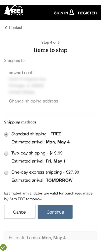
UX Guideline 15. Default to the Cheapest Shipping Option
Issue: In the absence of a default shipping option, customers must invest time in reading and understanding all alternatives before choosing.
Advice: Select the cheapest home-delivery option as the default during checkout (assuming the majority of users prefer this option, as per order logs).
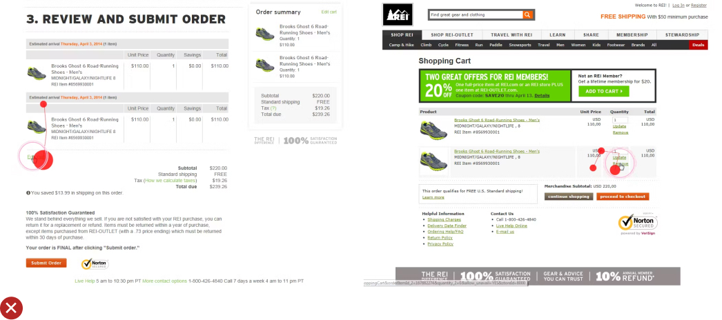
Examples: At REI, most customers quickly completed the shipping method selection, as many just verified the default free shipping option before proceeding. This shows the efficiency of having a default, especially if it’s the most cost-effective choice.
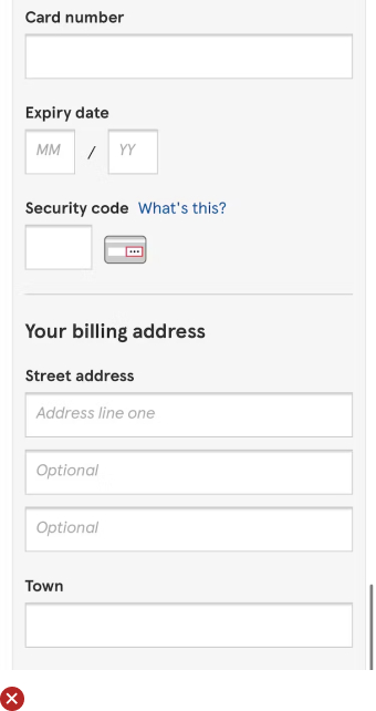
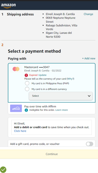
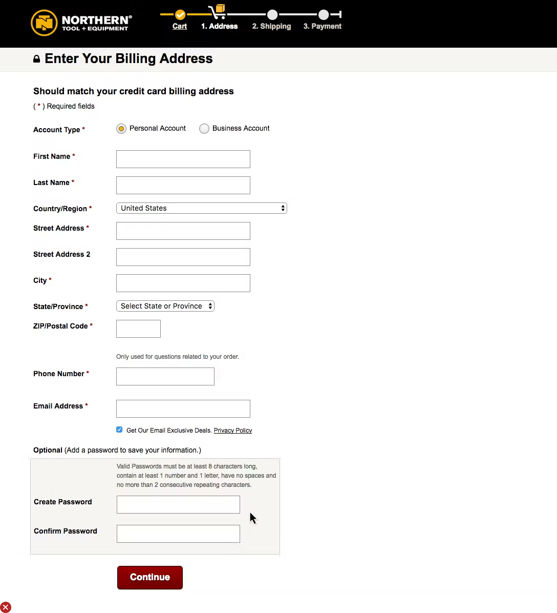
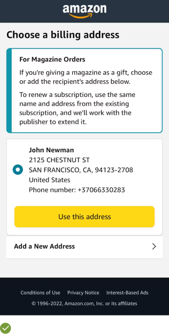
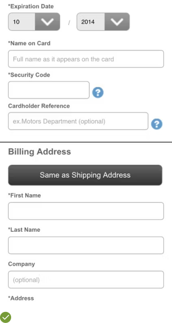
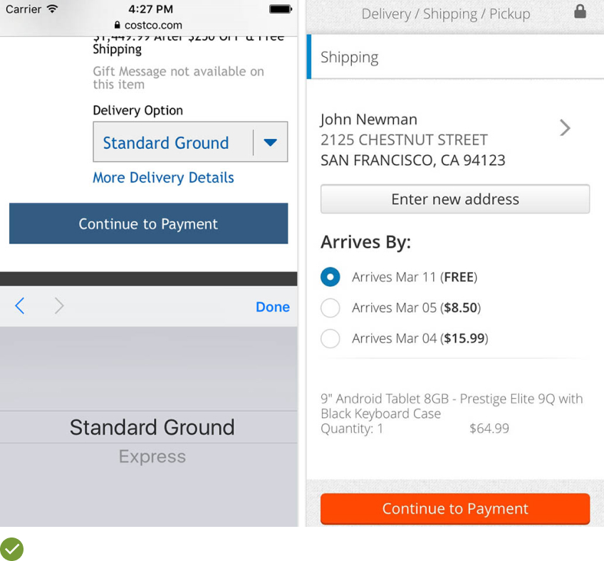
UX Guideline 16. Adopt ‘Shipping Address’ as Default ‘Billing Address’
Issue: Asking for both shipping and billing address separately can result in redundant typing, error introductions, and increase cart abandonments.
Advice: Pre-set the shipping address as the default billing address (unless stated otherwise), conceal billing address fields, and include a text summary of the billing address if it’s required for payment verification.
Example: An ecommerce platform like Amazon hides the billing address fields entirely by default and provides a textual summary, reducing typing effort for users, minimizing errors, and enhancing the checkout experience.
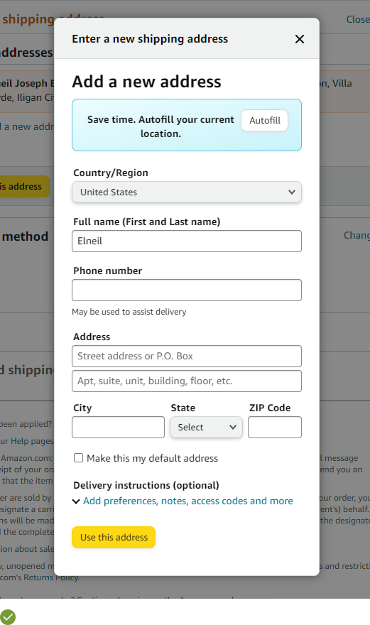
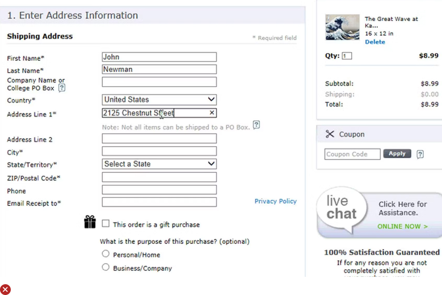
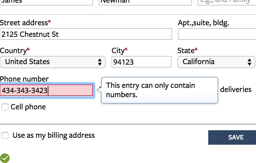
UX Guideline 17. Adapt Address Fields for Country-Specific Standards for International Orders
Issue: Non-local users may find foreign address structures unfamiliar and confusing, leading to errors and shopping cart abandonment.
Advice: Modify address form labelling and structure to correspond to the regional names of key international users.
Example: Amazon tailors its ‘Shipping Address’ form labels to match the country-specific terminology, offering international shipping, country selector, and ‘Address Lookup’ features.
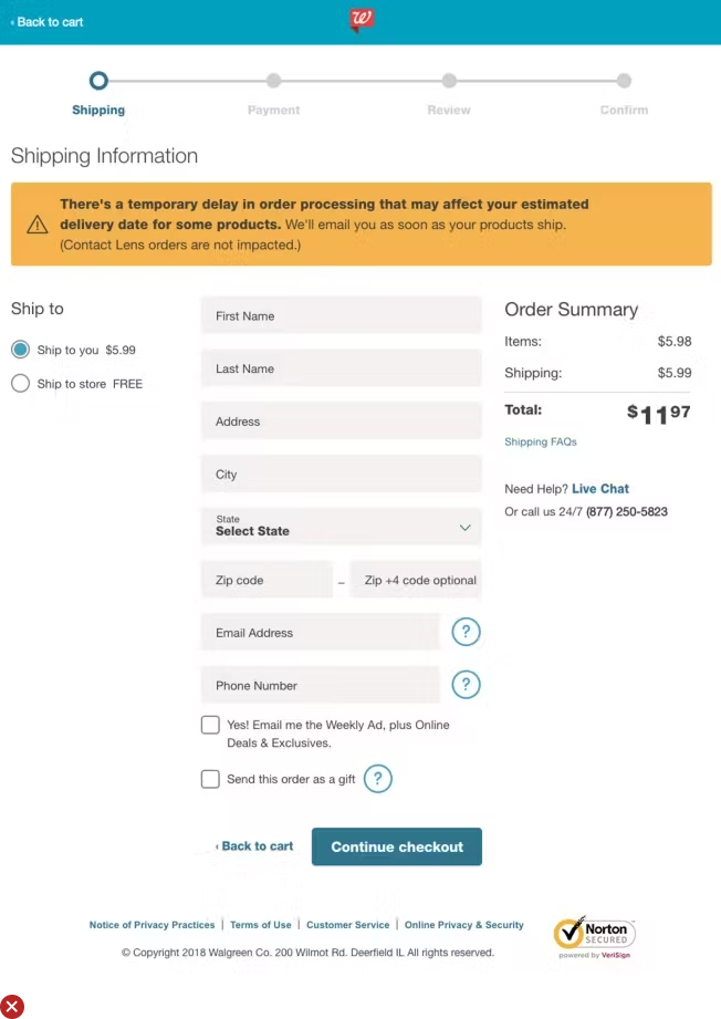
UX Guideline 18. Limit the Quantity of Form Fields Presented by Default
Issue: A large quantity of form fields can intimidate users.
Advice: Eliminate unnecessary fields from the checkout process. Implement intelligent form field features to minimize optional fields. If 10-15 form fields are still visible, use multiple steps and add white space for a grouped view.
Example: Online retailers such as eBay use collapsible sections and preselected options to reduce the number of visible fields, making the checkout process more user-friendly and less overwhelming.
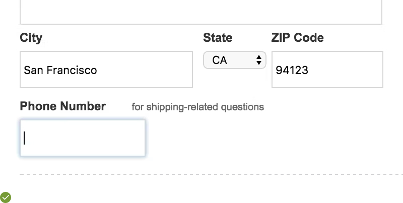
UX Guideline 19. Clarify the Necessity of Requesting Certain Personal Data
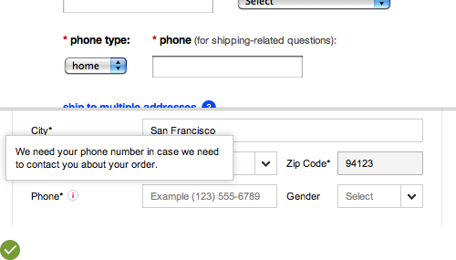
Issue: Some users may hesitate or abandon checkout rather than providing seemingly irrelevant personal information.
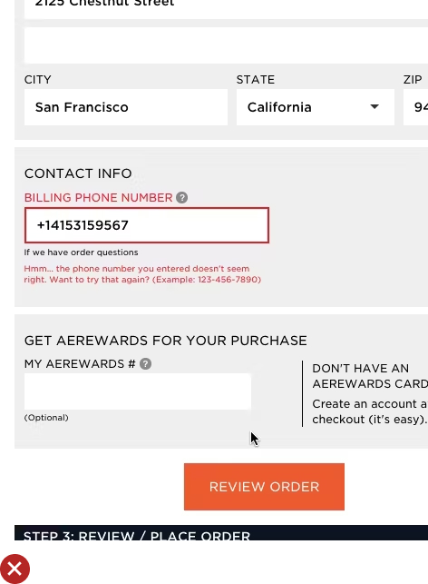
Advice: Avoid asking for personal details that aren’t crucial to complete the checkout, especially phone number, date of birth, or gender. If such details are required, explain why and how the information will be used.
Example: Target provides an inline explanation for requesting a phone number, stating that it’s “for shipping-related questions”. This approach assuages privacy concerns and justifies the data request.
UX Guideline 20. Explicitly Label Both Required and Optional Fields
Issue: Unless clearly indicated, optional fields may be misinterpreted as necessary and vice versa, leading to form-filling friction.
Advice: Ensure all form fields are clearly labelled as either required or optional.
Example: Grainger clearly marks both optional and required fields on their forms, enabling users to efficiently navigate through them. This practice minimizes confusion and speeds up the checkout process.
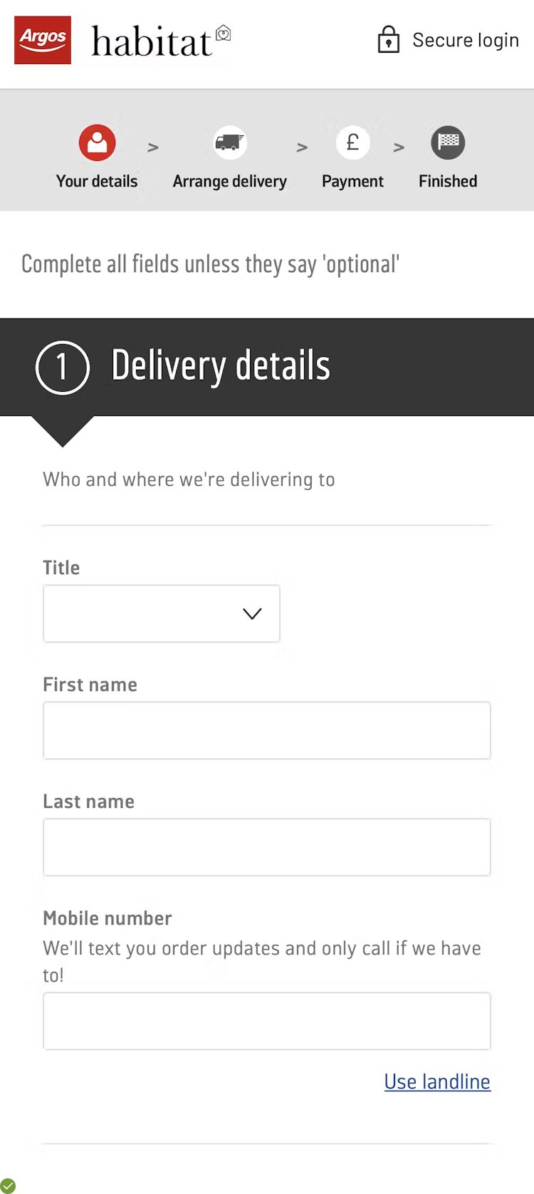
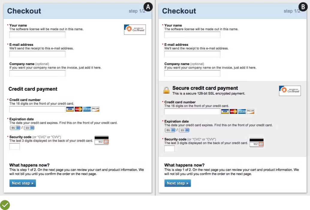
UX Guideline 21. Inline Labels: A Potential Source of Confusion
Issue: Inline labels that vanish when users begin typing can lead to errors and forgetfulness about the required input, hindering the checkout process.
Advice: Stick to traditional labels placed outside the form fields to avoid any misunderstanding. Though the floating labels, which rise to the top when users start typing, can be a viable alternative, ensure error messages are clear and easily identifiable.
Example: Argos uses the traditional approach of placing labels outside form fields (first image). Alternatively, the concept of ‘Floating Labels’ is well illustrated by the second image where the label, initially placed inside the field, floats to the top once users begin typing.
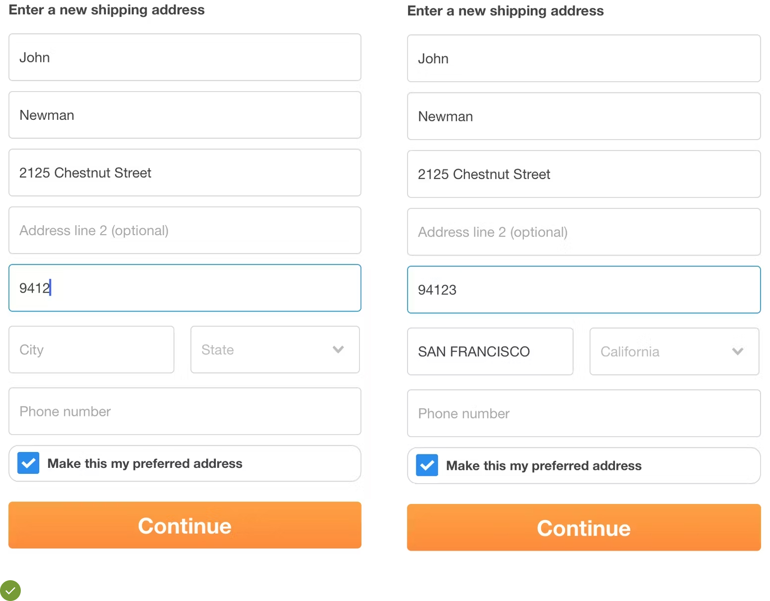
UX Guideline 22. Facilitate the Process: Pre-fill Related Fields
Issue: Repeating the same information within a short span is tedious for users and slows down their checkout process, causing frustration and inefficiency.
Advice: If users are likely to duplicate the information in related fields, automatically pre-fill those fields using their earlier inputs. This includes information typed during the entire browsing session.
Example: If a user inputs a ZIP code in a “Shipping Calculator” (first image), it should automatically pre-fill as the shipping address ZIP code (second image). Most users calculating shipping costs for a specific ZIP code will also want to ship their order to the same location, thus making this feature a time-saver.
UX Guideline 23. Optimize Optional Inputs with the Right Interface
Issue: Depending on the type of optional input, certain interface choices may cause unnecessary friction for the user.
Advice: Display optional form fields prominently only for common inputs. For less frequent inputs, hide them behind a link. Reserve checkboxes for genuine opt-in/out scenarios and be cautious with radio buttons and dropdowns for entirely optional inputs.
Example: Optional form fields are ideal for inputs where most users know what to input, like optional phone or password fields. Checkboxes are great for opt-in/opt-out choices, like newsletter signups or agreeing that shipping and billing addresses are the same. Links are perfect for hiding complex or infrequently used fields, like company name or delivery instructions.
UX Guideline 24. Value User Input: Don’t Erase Their Data
Issue: Users don’t anticipate websites to erase their typed input or selections unless there are validation errors.
Advice: Never silently clear or overwrite user inputs. Preserve their data or selections, or inform them upfront if their earlier actions or choices will be superseded.
Example: In scenarios where it’s impossible to determine whether users would prefer their input overwritten, it’s advisable to have users verify an uncommon and irreversible action rather than discarding their data.
UX Guideline 25. Implement Tooltips for Uncommon Features or Fields
Issue: Some features or fields may require additional explanations which, if always visible, can distract users who don’t need them.
Advice: For clarifications important to most users, use short permanent descriptions for fields or features. For less common fields, selections, or features, use tooltips which can be expanded for further details.
Example: Tooltips can provide additional descriptions or clarifications without cluttering the visual space, and can delve into more depth than permanently displayed field descriptions. This can help in explaining why information is required, how it is used later on, and how it should be formatted. Tooltips are beneficial for fields, selections, or features that might not be intuitive to all users.
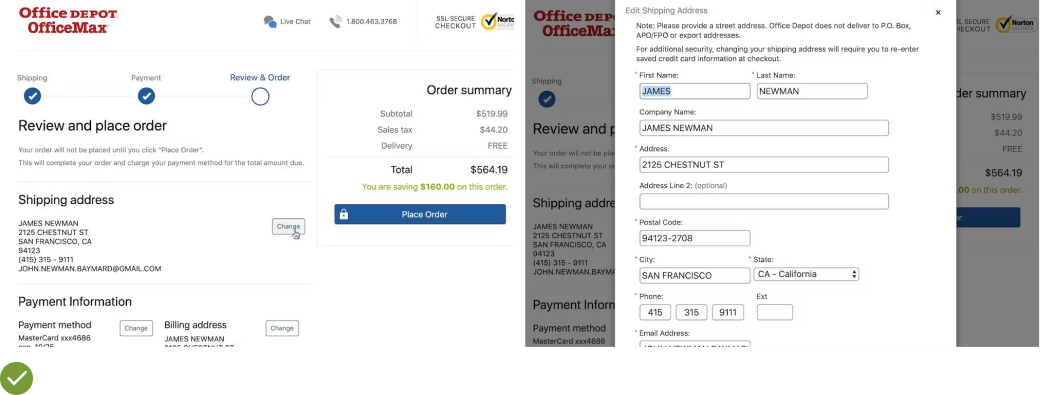
UX Guideline 26. Enable Direct Data Editing at Review Stage
Issue: The necessity to edit previously entered information can disrupt user flow when it requires navigation backwards through the checkout process.
Advice: Facilitate direct data editing at the review step, either via inline form fields or page overlays.
Example: If a user realizes at the order review stage that they’ve entered a quantity of one lamp when they intended to purchase two, inline editing can simplify corrections. Users can amend errors without leaving the review step. Alternatively, complex changes, such as address modifications, can be handled effectively via page overlays. These overlays allow users to make necessary amendments without being redirected backwards through the checkout process.
UX Guideline 27. Replace “Apply” Buttons with Auto-Updates and Change Highlights
Issue: Users can overlook and misunderstand “Apply” buttons during checkout, potentially leading to data loss.
Advice: Rather than requiring users to click “Apply” to save data, auto-save user inputs. If these changes affect core order values, make sure to highlight the changes.
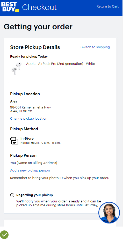
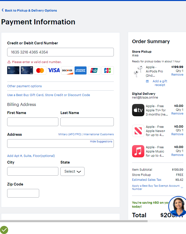
Example: Take Best Buy as an example, when users specify a “pickup person”, their inputs are saved automatically when they progress in the checkout process by tapping the primary “Continue” button at the bottom of the page. Such an approach reduces friction and prevents data loss that could lead to order abandonment.
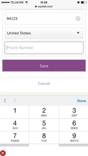
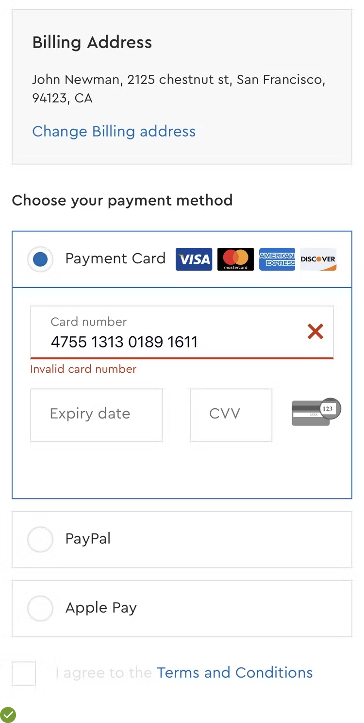
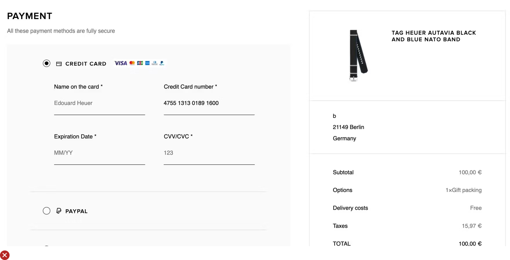
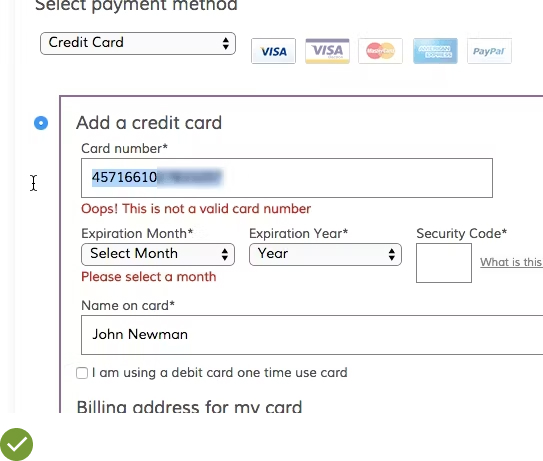
UX Guideline 28. Implement Luhn Validation for Credit Card Numbers
Issue: If card number input isn’t checked for errors before being submitted to the payment processor, it can result in unnecessary data-loss validation errors.
Advice: Use live Luhn validation on credit card number fields before the complete card data set is submitted (front-end validation).
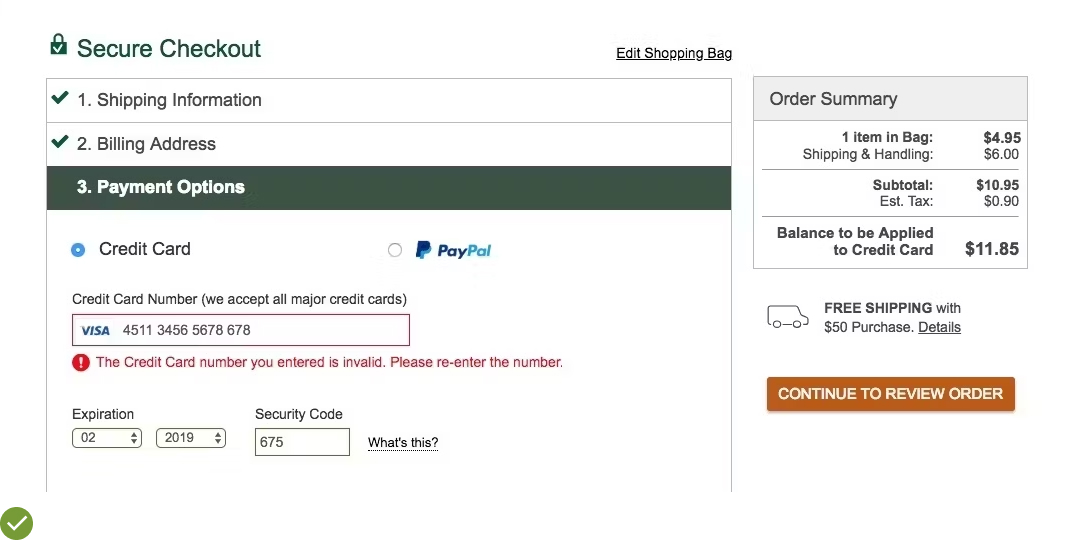
Example: Wayfair uses live Luhn validation, which instantly alerts users about any incorrect entries in their credit card numbers. This immediate feedback allows users to correct errors while the input is fresh in their minds, improving overall user experience and reducing the chances of subsequent validation issues.
UX Guideline 29. Autoformat Spaces in the ‘Credit Card Number’ Field
Issue: The lengthy 15–16 digit credit card number can be difficult for users to type and verify.
Advice: Implement autoformatting for the credit card number as users type with an input mask. If an input mask isn’t used, permit users to enter spaces.
Example: Best Buy auto-formats the credit card number with spaces as users type. This approach not only simplifies the entry process but also aids in the accurate verification of the card number, minimizing potential validation errors.
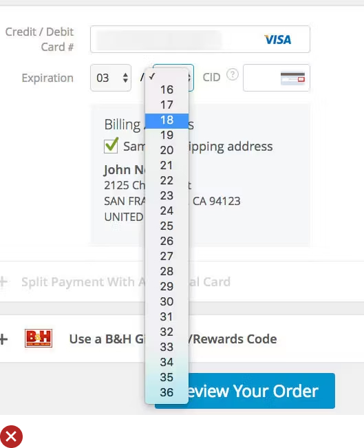
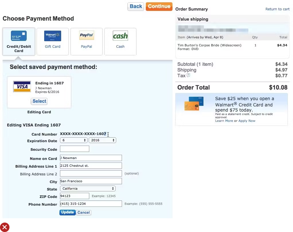
UX Guideline 30. Adopt a 2-Digit Month and Year Format for Expiration Date Drop-Downs
Issue: Forcing users to translate the expiration date printed on their cards to fit non-standard online fields can lead to unnecessary validation errors or disruptions in form filling.
Advice: Align the format of online credit card expiration date drop-downs with that on physical credit cards — 2 digits for both the month and the year, either “03 / 16” or “03 – March / 16”.
Example: Walmart uses a standard, 2-digit month and year expiration date design. This allows users to tab into each field and input the expiration date directly, mirroring the format presented on most credit cards. This user-friendly design reduces the likelihood of errors and smoothes the checkout process.
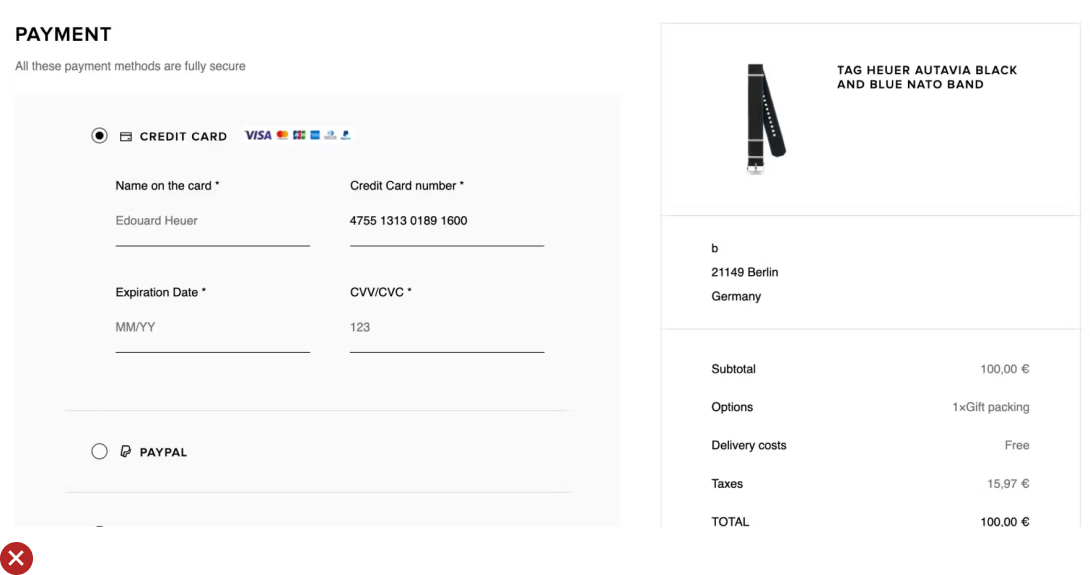
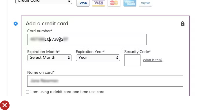
UX Guideline 31: Make ‘Cardholder Name’ Entry Clear and Precise
Issue: Uncertainty often surrounds what should be entered in the ‘Cardholder Name’ field. This lack of clarity can affect the payment validation process and lead to checkout abandonment.
Advice: Label the ‘Cardholder Name’ field accurately, inform users to input the name as it is printed on the card, and consider auto-filling the field with previously provided user information.
Examples: At the Disney Store, the field is labeled as ‘Cardholder name,’ with clear instructions to enter it ‘as it appears on the card.’
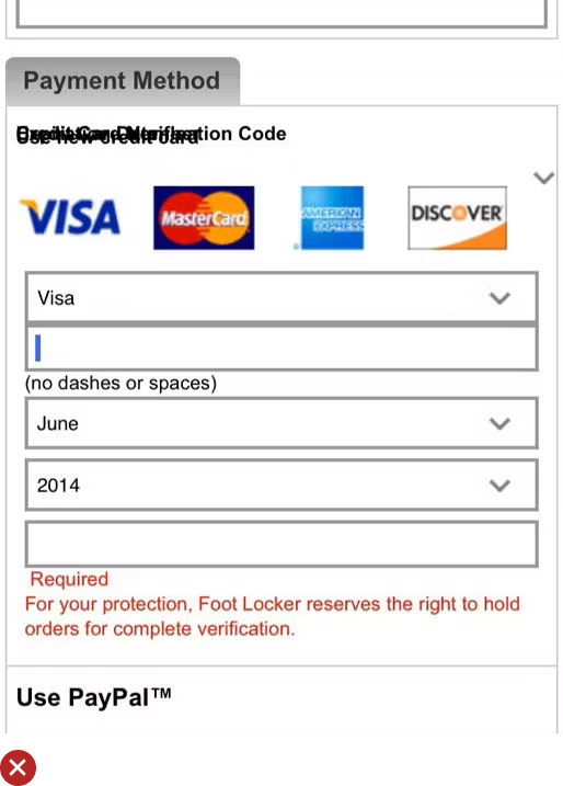
UX Guideline 32: Enhance Visual Emphasis on Credit Card Field Security
Issue: User confidence in providing their payment information relies significantly on their perception of the form’s security.
Advice: Visually enhance the security of credit card fields using unique styling. Consider encapsulating payment fields and employing recognized security seals.
Examples: Users were observed to express more trust in pages where the credit card fields seemed visibly distinct and more secure compared to less-sensitive information fields.
UX Guideline 33: Distinguish Primary Button Through Unique Styling, Consistent Placement, and Descriptive Naming
Issue: Users often determine the primary action button based on visual cues rather than the button’s microcopy, leading to potential confusion.
Advice: Make the primary button distinct by giving it a unique design, maintaining its consistent placement, and employing descriptive, context-specific microcopy.
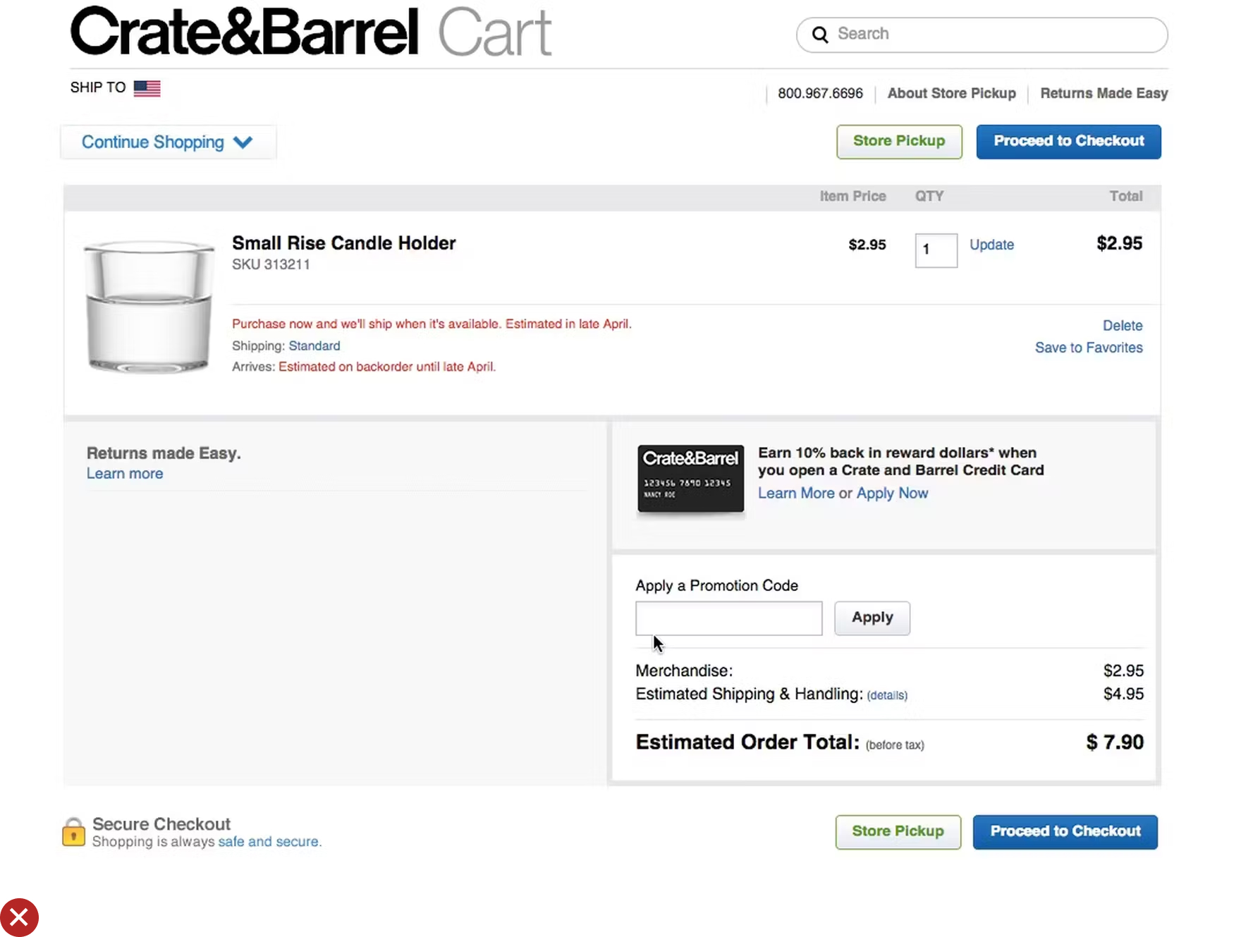
Examples: On the Crate & Barrel website, the primary button dynamically changes to “Continue to Review Page,” enhancing clarity on the user’s next step.
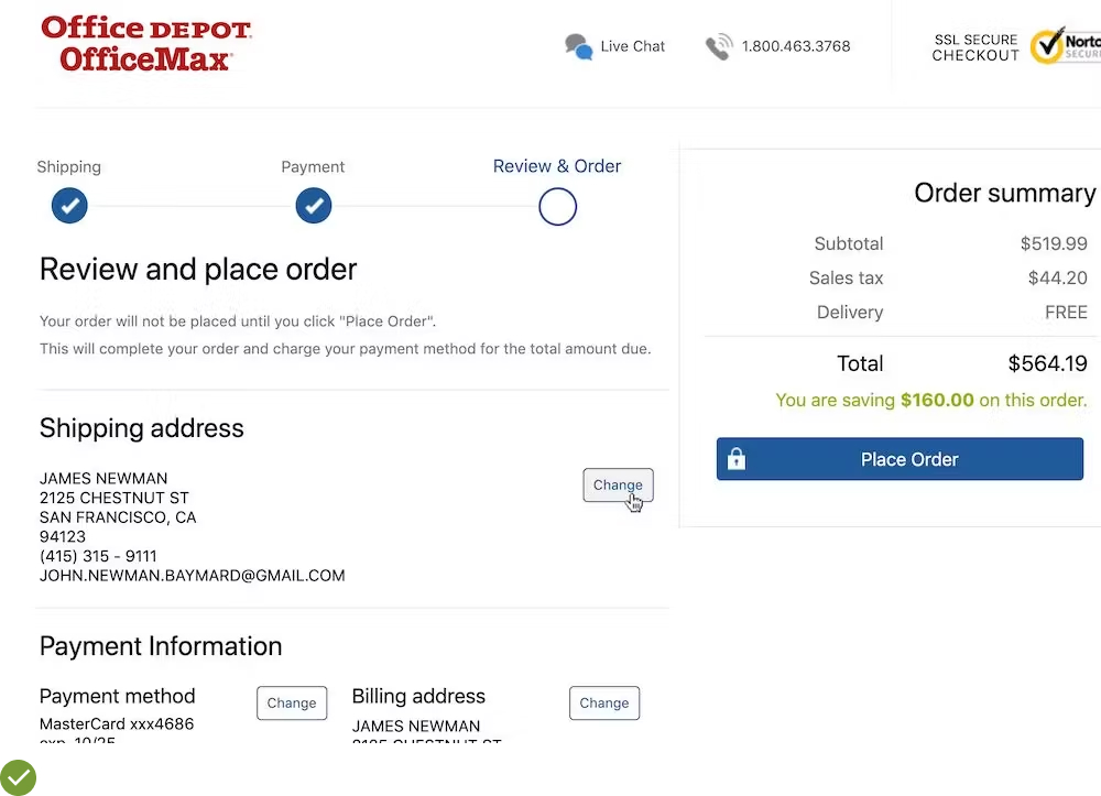
UX Guideline 34: Position a ‘Place Order’ Button Prominently at the Review Step
Issue: Users sometimes confuse the review step with the confirmation step, resulting in premature checkout exit.
Advice: Ensure the “Place Order” button is above the fold on the review step. Maintain consistency in the button’s placement across all checkout steps and include the confirmation step in the process.
Examples: To aid user recognition, the “Place Order” button should be highly visible and above the fold. The button’s position must remain consistent throughout the checkout process, as sudden changes can lead to user confusion. Also, including the confirmation step in the process steps aids users in understanding the checkout flow.
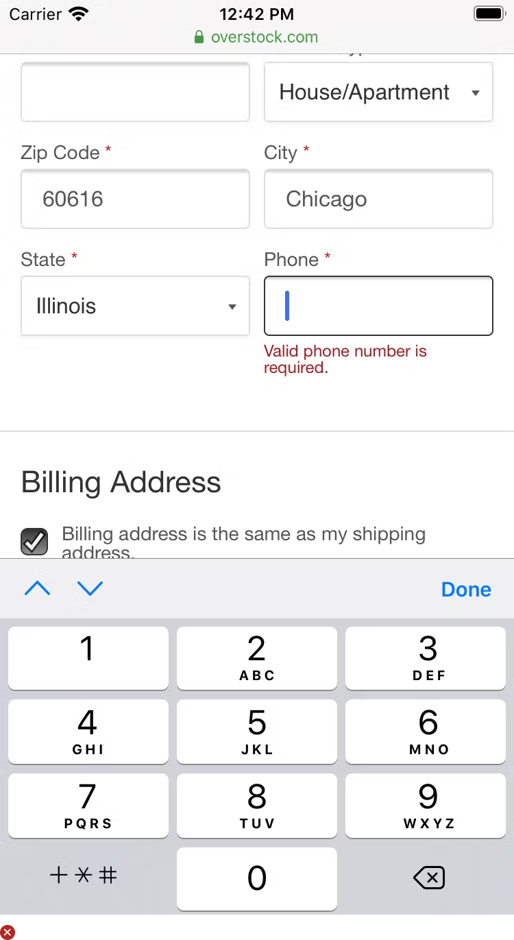
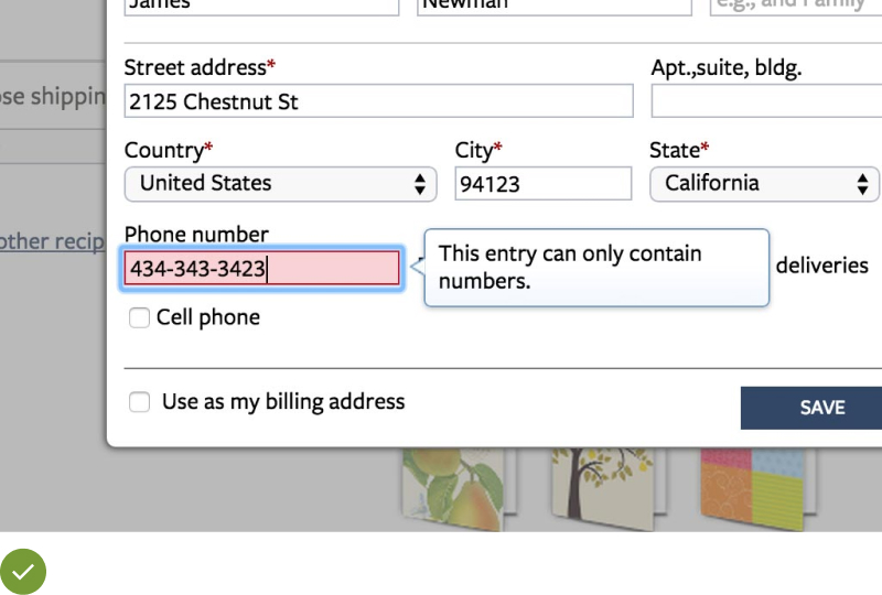
UX Guideline 35. Effective Introduction, Positioning, and Styling of Error Messages
Issue: The primary issue here lies in the users’ ability to identify when an error has occurred and discern the field causing the error for its resolution.
Advice: The best practice involves clearly marking the incorrect fields in red and positioning the error message in close proximity to the mistake. In the event of a single error, auto-scroll users to the fault. When dealing with multiple errors, a universal message outlining the existence of several errors should appear at the top of the page.
Example: In an ecommerce scenario, if a customer’s credit card fails to validate, the system could auto-scroll to the error location, making it easy for the user to identify and rectify the issue.
UX Guideline 36. Preservation of Users’ Input on Errors
Issue: Clearing or losing typed inputs because of validation errors leads to high levels of user frustration.
Advice: Make sure all data entered by the user, including selections, are retained even when form-validation errors occur.
Example: For instance, during mobile usage on Android devices, inadvertent page reloads while scrolling up were common. To enhance user experience, all typed data and selections should be preserved even after these inadvertent page reloads, like Target does with the gift checkbox.
UX Guideline 37. Implementation of ‘Adaptive Error Messages’ for Specific User Errors
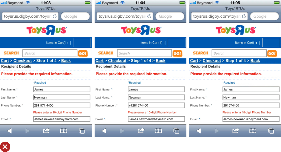
Issue: Generic validation errors often provide little assistance for users to understand and correct the validation error.
Advice: Implement ‘Adaptive Error Messages’ that clearly define the exact sub-issue leading to the user’s specific input validation failure, and guide the user on how to correct it.
Example: Instead of displaying a general error like “Invalid ZIP code”, users can be provided with a more specific error such as “The state entered is not valid with the ZIP code entered.”
UX Guideline 38. Application of Inline Validation with Advanced ‘Live’ Logic
Issue: Encountering errors long after they’ve occurred makes it unnecessarily inefficient for users to locate and rectify them.
Advice: Implement live inline validation without premature validation. Carry out live checks at every keystroke as users update incorrect fields, and withdraw error messages immediately once a valid input is detected. Consider integrating positive inline validation as well.
Example: In a situation where a user initially enters two numbers incorrectly in their credit card number, they can quickly correct the error before clicking “Continue” if the platform, like Wayfair, has implemented live in-line Luhn validation.
The Power of Checkout UX: Turn Your Leaky Bucket into a Brimming Well
In the end, your ecommerce website’s UX design serves as a secret treasure map leading to a goldmine of customer satisfaction and increased sales.
Just as you would fervently dig if you had a map to an actual treasure, so should you delve into this treasure of usability knowledge and apply the guidelines.
The choices you make in your UX Cart & Checkout theme design can transform your site from a ‘leaky bucket’ to a ‘brimming well’ of customer satisfaction.
By implementing these scientifically researched guidelines, you will create a seamless and enjoyable journey for your customers, from the moment they select a product to the thrilling final step of completing their purchase.
Start digging and unveil the immense potential buried within your ecommerce website!
