
The following video covers the top 5 UX issues with On-sight Search for the Independent Living Specialists online store.
“If They Can’t Find It, They Can’t Buy It.”
When e-commerce search works, it can feel almost magical: users naturally type in what they’re looking for, and it is served up in mere milliseconds. It’s fast, convenient, and efficient. No wonder some users generally prefer search over fiddling around in the site’s categories, clicking on link after link.
Unfortunately, e-commerce search all too often doesn’t work that well, indeed more commonly e-commerce search engines do not meet the ever-increasing expectations of users, who largely construct product related search queries on e-commerce sites the same way they search for products on Google.
Watch the video:
Transcript:
Hi, it’s Campbell from Blaze here.
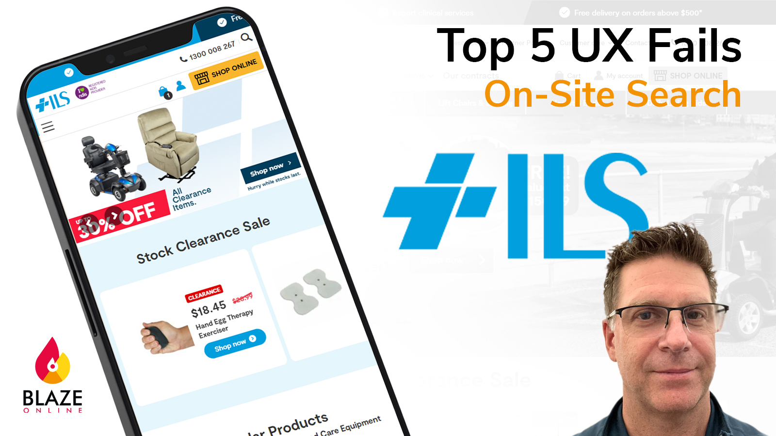
Today we’re looking at the UX or usability of Independent Living Specialists. Independent Living Specialists is Australia’s number one retailer in Mobile solutions, with over 40 retail stores across Australia.
The site is built on WooCommerce and if we take a look at Similar Web. We can see that they’re ranked within the top 10,000 websites in Australia, a great achievement and they’re consistently getting around 80,000 visitors a month. So very healthy traffic.
In terms of performance, let’s take a look at their GTmetrix scores. GTmetrix gives them a C overall. They’ve got some render blocking issues here that are affecting how quickly the page will load and become interactive for users. But overall, they’re doing reasonably well.
Now, let’s take a look at the usability or UX of the site. The better the user experience generally, the better the conversion rate for an online store. And we like to summarize usability as not needing the visitor to the site to think in any way – anything that they need to do – any next steps are intuitive and right there on the screen and easy for them to add a product to the cart and complete the checkout. Any time they have to think about something, that’s a usability fail.
We audited Independent Living Specialists against research-backed UX criteria that we know to have the biggest impact on commerce usability. And here are the results.
They performed very well in terms of the home page, but have very low scores in all other themes, particularly mobile, which is becoming increasingly important.
Today we’re going to focus on On-Sight Search. Search is one form of product discovery. But we know from research and data that visitors to the site that use search are four times more likely to make a purchase. So getting search right has a direct impact on your conversion rate.
We’re going to review the top five UX issues with the Independent Living Specialists’ site.
Normally, I’d do a review like this on the mobile version of the site. The idea being that if you’ve got good usability on a mobile, the desktop is going to automatically have good usability. But today we’re going to do most of this review on the desktop. And the reason for that will become obvious in a moment
The first UX issue is no predictive search on a mobile. When we click into search here and type in a term scooter, for example, we see some results here. They come up quite slowly. They should be faster than that, but they come up nonetheless. So they have predictive search results, which is great. That’s critical on all online stores. But if I switch to the mobile view of the site. And I go to the search. Type in my same term – Scooter – there’s no predictive search, none. So for the mobile user of the site, they don’t get that predictive search, which is a massive negative impact on the usability of the site. So we’re going to switch back to the desktop.
Now, Fortunately, that will be an easy fix for Independent Living Specialists to convert their mobile search to use the same search they’re using on the desktop.
The second e-commerce UX issue with the usability of search is the exclusion of categories. There are no categories in the search results here. So let’s say, for example, I’m searching for scooters again. What I get here is all 65 products in the search results. But let’s say I wanted to go straight to the category and browse all of the scooters that are available. That option isn’t available through search. So adding categories to your search results is also going to improve usability.
Number three is the lack of synonyms. Synonyms are using similar words for the same kind of search. To give you another example, I might be looking for a walking stick. So I search on walking stick. I get 20 results on this search, but a lot of people use the word cane. Now I get different results. I get 11 in this time, but they’re the same product type – I should be able to search on both walking sticks or walking canes and get the same list of products there. So again. Making all the products that are relevant to my search accessible right there on the page.
The fourth UX issue is a minor one, but it’s still relevant. It’s the use of symbols in your search. Symbols, meaning the symbol for inch or. Things like that. So if I do a search on 18 inch there are no results. But if I change that search to be 18″ with the symbol, I get 55 results. Again, I should be seeing the same results regardless of whether I use the word inch or centimetres or I use the symbol for inch or I use CM.
The fifth and final ecommerce UX issue that I’ll cover today is what happens when there are no results for my search. Let’s just say I do a random search, and there are no results there. Best practice is to have at least some popular products and popular categories here. You’re not giving them anywhere to go from here. They’re just getting a ‘no results’ page. But if you can at least give them some other way to engage with your products, then that’s going to increase the likelihood that they’re going to find the product of interest.
That covers the five UX issues with on-sight search for Independent Living Specialists. The more you improve the usability, the more likely people are going to find products on your site, they’re going to add them to the cart and they’re going to complete the checkout, so better usability equals more conversions.
Blaze online specializes in ecommerce UX and online stores built on WooCommerce. Reach out to us if you’d like to have a chat.
Thank you.
